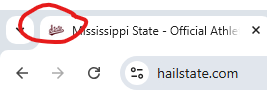
That's my point in all this. The little logo on the address bar is still banner, and then the bottom of the website has the banner, but it's not the primary logo that is shown in prime position. This should be reversed.
When I go to On3 or 247, they have the &tate rather than the banner M.
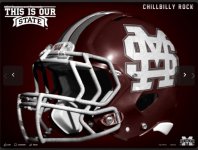
Same thing for the logos all over the other athletic facilities. 50 yard line, mid-court, outside lights, etc. Baseball can keep M over S since there is tradition there. But the banner M should still be prevalent around DNF.
The TV still shows the banner M thankfully (like where they show scores and such, and game highlights, etc.), because they aren't under the influence of our folks I suppose.
It's not about uniforms.
I know, dead horse and all that. But I alerted everyone it was a logo thread, so if you don't care, then you can exit the thread at your earliest convenience.
