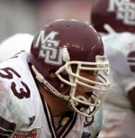
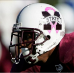
New helmets this week?
- Thread starter RiceDawg
- Start date
You are using an out of date browser. It may not display this or other websites correctly.
You should upgrade or use an alternative browser.
You should upgrade or use an alternative browser.
I am here for it. I really wish we would lean harder into being “State”
What ever it is, it is not the banner M. This is a win
Meh. We have a logo we've been identified with for over 20 years. If we're going to go with anything else, it needs to be a real upgrade. This just isn't. Also, not a fan of white helmets at any time.
State or MSU?
i feel like fans would go nuts if we put if MSU on the helmet for uga game
I too have PTSD related to the croom years, but I have softened a bit on the white helmets.Meh. We have a logo we've been identified with for over 20 years. If we're going to go with anything else, it needs to be a real upgrade. This just isn't. Also, not a fan of white helmets at any time.
i love my bulldogs but DAMMIT — THERE ARE WAY TOO MANY HELMET DESIGNS. WE ARE THE OREGON OF THE SEC
+sigh+
+sigh+
The State script is a huge upgrade over that abomination we've had the last 20 years.Meh. We have a logo we've been identified with for over 20 years. If we're going to go with anything else, it needs to be a real upgrade. This just isn't. Also, not a fan of white helmets at any time.
What does everyone hate the banner M? Is it just the Croom association? I like all white kits with maroon stripes and accents.
Trying to give L4 a hard on. **So is that guy wearing a mask in that helmet?
if we put as much dollars and effort in more important things in our program OTHER THAN LOGOS and DESIGNS over the last 60 years, we could be having more win success on the competition battlefieldsWhat does everyone hate the banner M? Is it just the Croom association? I like all white kits with maroon stripes and accents.
instead let’s focus on fonts, colors, and other @&$) that is incremental in value
pisses me off
AMEN
I'm sick of the constant changes, just get a good one and go w/ it. I can't stand the white helmets/masks or the "banner" logo either. Put the MoverS on a maroon helmet and lets go!
If you have to ask, you wouldn’t understand.What does everyone hate the banner M? Is it just the Croom association? I like all white kits with maroon stripes and accents.
Yeah we should just come out in comic sans M-State****if we put as much dollars and effort in more important things in our program OTHER THAN LOGOS and DESIGNS over the last 60 years, we could be having more win success on the competition battlefields
instead let’s focus on fonts, colors, and other @&$) that is incremental in value
pisses me off
AMEN
Unpopular opinions below:
I do not like the Croom multi-ruffled banner M. That level of fine detail in a modern logo is asking for trouble. It doesn't look good on a screen, or embroidered, etc. I liked the attempt but those ruffles are junk.
The revised banner M is a good, solid logo. Nothing wrong with it, but nothing particularly GREAT about it either. It's okay, all things considered. It is definitely functional for all media -- print, embroidery, on screen, graphics, etc. It's versatile and reproduces in a lot of situations. The lettering does require a certain size to be cleanly reproduced, but it's not nearly as bad as the tiny detail on those ruffles.
The interlocking MSU logo(s) - frankly, they always seemed relatively uninspired to me. "Hey, let's link the letters together!" But I get that they have nostalgic attraction. They're fine but I don't think they're the pinnacle that others do. And I really prefer pushing "Mississippi State" or "State" more than just "MSU" for branding purposes.
If our team had achieved more success during the space race years, the Flying-M might have gotten more traction. I love that logo because of the application not just to the athletics, but to the university's overall achievement/stature/positioning. Love my Flying-M cap!
I think the script State is fun and all, and it will definitely be exciting if that (or interlocking MSU) shows up on the helmet, but it absolutely feels like someone just tried fonts on Word until one looked okay and then made it maroon. "Hey, look, another logo!" There's nothing really distinctive about it.
Whatever comes next needs to be at least as good and versatile as the revised banner M-State.
I do too. Hopefully, they won't be wearing maroon trousers this week.I love when we go all white. Should do it once or twice a year, at either A&M, Bama or Arkansas.
This is a dumb reason to be pissed off. The fact that we've had graphic designers do work for us over the years (either hired or in-house) has beyond nothing to do with our performance on the field or on the court in any sport. Even if it did in theory, and we'd not spent any of that money on design work and instead put it all in the [pick your own sport] budget, it wouldn't come close to being a meaningful sum compared to what that program's total budget is.if we put as much dollars and effort in more important things in our program OTHER THAN LOGOS and DESIGNS over the last 60 years, we could be having more win success on the competition battlefields
instead let’s focus on fonts, colors, and other @&$) that is incremental in value
pisses me off
AMEN
So, the idea that spending money on changing logos or fonts or whatever over the years has in any way hampered our in-game performance is nonsensical.
Don’t care for the monochrome look. Really prefer either jersey over grey.I love when we go all white. Should do it once or twice a year, at either A&M, Bama or Arkansas.
so fiscal management is unimportant to you?This is a dumb reason to be pissed off. The fact that we've had graphic designers do work for us over the years (either hired or in-house) has beyond nothing to do with our performance on the field or on the court in any sport. Even if it did in theory, and we'd not spent any of that money on design work and instead put it all in the [pick your own sport] budget, it wouldn't come close to being a meaningful sum compared to what that program's total budget is.
So, the idea that spending money on changing logos or fonts or whatever over the years has in any way hampered our in-game performance is nonsensical.
Pretty much spot on with that. The Flying-M helmet we wore a couple of years ago was a disappointment though. It didn't look nearly as good as I thought it would.Unpopular opinions below:
I do not like the Croom multi-ruffled banner M. That level of fine detail in a modern logo is asking for trouble. It doesn't look good on a screen, or embroidered, etc. I liked the attempt but those ruffles are junk.
The revised banner M is a good, solid logo. Nothing wrong with it, but nothing particularly GREAT about it either. It's okay, all things considered. It is definitely functional for all media -- print, embroidery, on screen, graphics, etc. It's versatile and reproduces in a lot of situations. The lettering does require a certain size to be cleanly reproduced, but it's not nearly as bad as the tiny detail on those ruffles.
The interlocking MSU logo(s) - frankly, they always seemed relatively uninspired to me. "Hey, let's link the letters together!" But I get that they have nostalgic attraction. They're fine but I don't think they're the pinnacle that others do. And I really prefer pushing "Mississippi State" or "State" more than just "MSU" for branding purposes.
If our team had achieved more success during the space race years, the Flying-M might have gotten more traction. I love that logo because of the application not just to the athletics, but to the university's overall achievement/stature/positioning. Love my Flying-M cap!
I think the script State is fun and all, and it will definitely be exciting if that (or interlocking MSU) shows up on the helmet, but it absolutely feels like someone just tried fonts on Word until one looked okay and then made it maroon. "Hey, look, another logo!" There's nothing really distinctive about it.
Whatever comes next needs to be at least as good and versatile as the revised banner M-State.
So you've moved on from arguing that new graphic design affects on-field performance to it being fiscal mismanagement?so fiscal management is unimportant to you?
That's another dumb statement but I'll respond to it anyway: Paying someone to refresh a brand (i.e. design new logos, fonts, graphics, etc...) is a completely normal thing for any business/organization/entity to do and is in no way fiscal mismanagement. As I said above, the amount we've paid for design work over the years is negligible compared to what our athletic budget is.
And, again, changing our graphics/logos/whatever every so often has no bearing on on-field performance.
No one says you have to like the logos/designs we use. And it's fine to have the opinion that we should pick one and stick with it for a while. But you're grasping at some real tiny straws to find reasons not to change up our visual identity from time to time.
so visual identity consistency is unimportant to you?So you've moved on from arguing that new graphic design affects on-field performance to it being fiscal mismanagement?
That's another dumb statement but I'll respond to it anyway: Paying someone to refresh a brand (i.e. design new logos, fonts, graphics, etc...) is a completely normal thing for any business/organization/entity to do and is in no way fiscal mismanagement. As I said above, the amount we've paid for design work over the years is negligible compared to what our athletic budget is.
And, again, changing our graphics/logos/whatever every so often has no bearing on on-field performance.
No one says you have to like the logos/designs we use. And it's fine to have the opinion that we should pick one and stick with it for a while. But you're grasping at some real tiny straws to find reasons not to change up our visual identity from time to time.
I have always liked the white pants and jersey with maroon helmets on the road. I agree I hate the maroon pants on the road. Helmets should always be maroon, home and away.I do too. Hopefully, they won't be wearing maroon trousers this week.
you sound bitter. are you bitter?This is a dumb reason to be pissed off. The fact that we've had graphic designers do work for us over the years (either hired or in-house) has beyond nothing to do with our performance on the field or on the court in any sport. Even if it did in theory, and we'd not spent any of that money on design work and instead put it all in the [pick your own sport] budget, it wouldn't come close to being a meaningful sum compared to what that program's total budget is.
So, the idea that spending money on changing logos or fonts or whatever over the years has in any way hampered our in-game performance is nonsensical.
its the richard williams associationWhat does everyone hate the banner M? Is it just the Croom association? I like all white kits with maroon stripes and accents.
Yes, that Croom association of futility, as well as the fact that it was always the basketball logo before he adopted it.What does everyone hate the banner M? Is it just the Croom association? I like all white kits with maroon stripes and accents.
That older version Croom’s teams wore always looked like the Purina logo from a distance on TV. Terrible helmet.
After 20+ years, why would we still worry about what was spent on graphic designers to “update” the banner M?
That logo sucks on a water tower or a letterhead, let alone a helmet.
That logo sucks on a water tower or a letterhead, let alone a helmet.
I agree. I don't know why, but that helmet has always appealed to me, as well. Must be generational and of an era that was big we the Engineering program had a lot of aerospace research, NASA collaborations, etc.If our team had achieved more success during the space race years, the Flying-M might have gotten more traction. I love that logo because of the application not just to the athletics, but to the university's overall achievement/stature/positioning. Love my Flying-M cap!
No he’s just being honest that it’s a dumb argument (which it is).you sound bitter. are you bitter?
Latest posts
-
Since basketball may be the best thing …
- Latest: DAWGSANDSAINTS
-
Weather nerds........Milton
- Latest: OopsICroomedmypants
-
Wifi Extender Suggestions
- Latest: PooPopsBaldHead
Get unlimited access today.
