Thunder & Lightning: Mississippi State Needs to Make a Permanent Change

Dawgg

Well-known member
Sep 9, 2012
7,557
6,133
113
Why don't we ever talk about a cascading non-interconnected MSU as an option? Is it just too big and cumbersome to put on a helmet effectively or is it just not distinct enough?

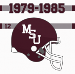
Something like the helmet logo from 79-85:
1692385938550.png

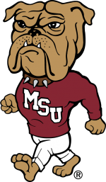
or like the one on the walking bully sweatshirt:
1692385797494.png
 
Last edited:

patdog

Well-known member
May 28, 2007
48,295
11,935
113
Why don't we ever talking about a cascading non-interconnected MSU as an option? Is it just too big and cumbersome to put on a helmet effectively or is it just not distinct enough?

Something like the helmet logo from 79-85:
View attachment 387384

or like the one on the walking bully sweatshirt:
View attachment 387382
The 90s version looks much better. If we go back, that needs to be the one we go back to. But really, we need to stay with the &tate logo for the next few years instead of constantly changing things.
 

Dawgg

Well-known member
Sep 9, 2012
7,557
6,133
113
Just reading the headline..... The permanent change that needs to be made is those two disassociated from the university.
Will Ferrell Anchorman GIF by AOK
 

Dawgbite

Well-known member
Nov 1, 2011
6,216
4,631
113
I personally think that the interlocking MSU looks cheap and high schoolish. I know I'm in the minority but I have more taste than most of you so there's that. State is my favorite, Chillbillys bulldog outline is second, M State is third, and Interlocking MSU is a distant fifth after just the jersey number on the helmet aka Bammer!
 

92Alum

New member
Oct 29, 2013
21
13
3
I personally think that the interlocking MSU looks cheap and high schoolish. I know I'm in the minority but I have more taste than most of you so there's that. State is my favorite, Chillbillys bulldog outline is second, M State is third, and Interlocking MSU is a distant fifth after just the jersey number on the helmet aka Bammer!
Everyone definitely has their own opinion. And we shouldn’t degrade our fellow fans for having a different opinion as all of these threads seem to diverge into. But here is mine: I think the interlocking MSU brings back a lot of nostalgia in folks my age that enjoyed those Jackie years (at least the winning ones) and that is why so many like it. But I agree with others that think it looks a little amateurish these days and we need to move on.
 

travis.sixpack

Well-known member
Mar 3, 2008
1,031
1,025
113
Uniforms have been a big topic for Mississippi State this offseason, and Brian Hadad and Robbie Faulk want to put a stop to the debate. The guys have a simple mandate, it is time for change, and this change is going forward by going back.


The post Thunder & Lightning: Mississippi State Needs to Make a Permanent Change appeared first on SuperTalk Mississippi.

More...
The Banner M will retire with a winning record (98-72) - 26 games above .500. The beloved interlocking MSU is 46-47. Hopefully it will move to .500 this season with a win over UK.
 
Sep 12, 2013
8,810
62
48
I personally think that the interlocking MSU looks cheap and high schoolish. I know I'm in the minority but I have more taste than most of you so there's that. State is my favorite, Chillbillys bulldog outline is second, M State is third, and Interlocking MSU is a distant fifth after just the jersey number on the helmet aka Bammer!
Ah, a man of culture.
 
  • Like
Reactions: Dawgbite

thekimmer

Well-known member
Aug 30, 2012
7,194
1,052
113
Why don't we ever talking about a cascading non-interconnected MSU as an option? Is it just too big and cumbersome to put on a helmet effectively or is it just not distinct enough?

Something like the helmet logo from 79-85:
View attachment 387384

or like the one on the walking bully sweatshirt:
View attachment 387382
For the love of God please, please, please, please, PLEASE just pick one and STICK WITH IT!!!!!!
 

Dawgbite

Well-known member
Nov 1, 2011
6,216
4,631
113
Everyone definitely has their own opinion. And we shouldn’t degrade our fellow fans for having a different opinion as all of these threads seem to diverge into. But here is mine: I think the interlocking MSU brings back a lot of nostalgia in folks my age that enjoyed those Jackie years (at least the winning ones) and that is why so many like it. But I agree with others that think it looks a little amateurish these days and we need to move on.
And I'm of that age, class of 87.
 

ChE1997

Active member
Feb 14, 2023
506
354
63
Uniforms have been a big topic for Mississippi State this offseason, and Brian Hadad and Robbie Faulk want to put a stop to the debate. The guys have a simple mandate, it is time for change, and this change is going forward by going back.


The post Thunder & Lightning: Mississippi State Needs to Make a Permanent Change appeared first on SuperTalk Mississippi.

More...
One thing to keep in mind for branding, Before 1985, there was no almost no College football on TV. Literally 4 games a weekend. So the 1990's Jackie Sherrill teams is what Mississippi State Football looked like to most of the country.

I like the State Script. But the Stacked MSU goes on our helmets.

And 17 Croom, and 17 Templeton for getting rid of it to begin with.
 

M R DAWGS

Well-known member
Apr 13, 2018
1,710
1,175
113
One thing to keep in mind for branding, Before 1985, there was no almost no College football on TV. Literally 4 games a weekend. So the 1990's Jackie Sherrill teams is what Mississippi State Football looked like to most of the country.

I like the State Script. But the Stacked MSU goes on our helmets.

And 17 Croom, and 17 Templeton for getting rid of it to begin with.

I couldn’t have said it better myself.
 

Trojanbulldog19

Well-known member
Aug 25, 2014
8,857
4,336
113
Everyone definitely has their own opinion. And we shouldn’t degrade our fellow fans for having a different opinion as all of these threads seem to diverge into. But here is mine: I think the interlocking MSU brings back a lot of nostalgia in folks my age that enjoyed those Jackie years (at least the winning ones) and that is why so many like it. But I agree with others that think it looks a little amateurish these days and we need to move on.
What would look professional to you?
 

Baddmann

Member
Sep 20, 2015
421
61
28
I personally think that the interlocking MSU looks cheap and high schoolish. I know I'm in the minority but I have more taste than most of you so there's that. State is my favorite, Chillbillys bulldog outline is second, M State is third, and Interlocking MSU is a distant fifth after just the jersey number on the helmet aka Bammer!
I agree with interlocking MSU. I don't mind using it for a game once a year, but I would prefer if we stick with our current logo.

I'm probably in the minority here but I like M State. I also like using the "STATE" word whether its script or not. (When I am shopping for gear, I love it when i find something with just "State" on it).

When I go to Starkville I tell folks I'm going to watch the ballgame at State.

Flame suit on...
 

Maroon13

Well-known member
Sep 29, 2022
1,753
1,759
113
We can’t beg for new uniforms, get them, and then immediately beg for more new ones.
That's the situation &elmon has created with the latest moves and having his strings pulled by 3 fan "journalist".

Keenum needs to have an off line talk with a few people.
 
  • Like
Reactions: RiceDawg

ChE1997

Active member
Feb 14, 2023
506
354
63
I agree with interlocking MSU. I don't mind using it for a game once a year, but I would prefer if we stick with our current logo.

I'm probably in the minority here but I like M State. I also like using the "STATE" word whether its script or not. (When I am shopping for gear, I love it when i find something with just "State" on it).

When I go to Starkville I tell folks I'm going to watch the ballgame at State.

Flame suit on...
We do need a consistent identity. Which is what the move to the State Script was supposed to be, because we were told our AD in the 90's was dumb enough to not have rights on our own logo. Now we know they were even more stupid than that.

We can have both.

We can use the State Script on the uniforms for all sports. Think of it like the MS baseball hat. We have many different logos on the jersey.


Keep the MS for baseball, Put the stacked MSU on the football helmet. Use the State Script on uniforms.

In some version of MSU history, Zacharias fires LT for trying to hire Bobby Wallace over Jackie in 1990. And we get a real AD to replace him. That real AD hires Urban Meyer from Bowling Green instead of Croom, and we have 4 national titles.

17 Templeton and his 1950's vision of MSU.
 

Dawgg

Well-known member
Sep 9, 2012
7,557
6,133
113
That's the situation &elmon has created with the latest moves and having his strings pulled by 3 fan "journalist".

Keenum needs to have an off line talk with a few people.
What’s your issue with Selmon? He’s been on the job for about 7 months and you’re already calling for his job. For what? Over a logo change?
 

Puppers

Well-known member
Oct 1, 2022
302
614
93
I personally think that the interlocking MSU looks cheap and high schoolish. I know I'm in the minority but I have more taste than most of you so there's that. State is my favorite, Chillbillys bulldog outline is second, M State is third, and Interlocking MSU is a distant fifth after just the jersey number on the helmet aka Bammer!

You think the interlocking looks cheap and highschoolish and prefer this?


1692539120877.png
 

patdog

Well-known member
May 28, 2007
48,295
11,935
113
What’s your issue with Selmon? He’s been on the job for about 7 months and you’re already calling for his job. For what? Over a logo change?
Larry Templeton would be proud of the first coaching decision Selmon has made. So yeah, I’ve got an issue with him. I’m fine with the new logo though.
 

QuadrupleOption

Well-known member
Aug 21, 2012
1,012
804
93
I like the &tate logo, the interlocking MSU, the flying M, and the pirate logo. I liked the "Mississippi" helmets we wore to honor Sonny Montgomery.

I love alternate uniforms and logos, and think we should have at least two games a year featuring cool new combos.

I don't really care if we stick with the banner M as the official logo for MSU as a whole - it's fairly distinctive and can fit on a letterhead.

But for football? Who gives a damn? Change the helmet every game - anyone who knows the SEC or college football probably already knows who we are. The ones that don't know us already don't matter. This is for our fans, not them.
 

Dawgg

Well-known member
Sep 9, 2012
7,557
6,133
113
Larry Templeton would be proud of the first coaching decision Selmon has made. So yeah, I’ve got an issue with him. I’m fine with the new logo though.
That he didn’t fire Lemonis?

I don’t disagree that he probably should have been fired, but I mean I also understand why Selmon gave him another season. I don’t know that I would call it Templeton level though.
 
Get unlimited access today.

Pick the right plan for you.

Already a member? Login