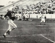
The &tate script looks like crap midfield and on the helmets. I like the logo, it just is not "powerful" and does not look like a football logo.
The interlocking MSU is disappointing and dated on apparel. I think it will look great on uniforms.
The interlocking MSU is disappointing and dated on apparel. I think it will look great on uniforms.


