
The overall reaction to the University of Kentucky's new secondary Wildcat logo hasn't been a positive one. For the most part, fans seem to be pretty displeased with the new design.
Many say it's a blatant rip of other Wildcat logos, namely Kansas State; while others didn't see a need in adopting a new logo at all.
Personally, I like the new logo, although I didn't think I would when I caught a glimpse of it last night. It's already growing on me and I think many of you will be able to say the same as UK gradually incorporates it into more and more things.
No matter which side of the discussion you're on, it is here to stay and I think we should all have a little fun with it tonight. So let's do that by poking fun at our own favorite team's new "fierce" Wildcat...
It kind of looks like the East High School logo in High School Musical.
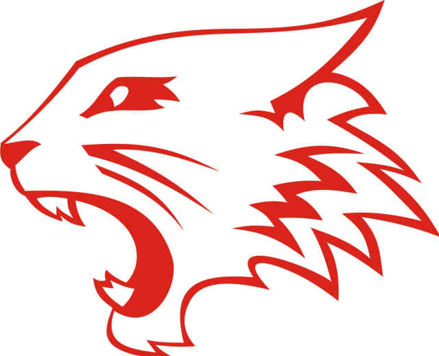
So I'm told. I've never seen
High School Musical.
It also looks the ThunderCats logo.

Or...
Maybe a bottle of Fireball.

I don't see that one as much, but it was a popular comparison today.
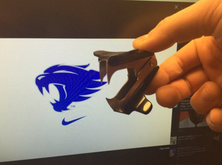
SBNation compared it to a staple remover.
[caption id="" align="alignnone" width="550"]
 @SBNationCFB
[/caption]
This one may be my favorite.
Another one that made me laugh is the blowdryer effect.

But I think we can all agree...
It's definitely two birds in a loving embrace.

 The overall reaction to the University of Kentucky's new secondary Wildcat logo hasn't been a positive one. For the most part, fans seem to be pretty displeased with the new design.
Many say it's a blatant rip of other Wildcat logos, namely Kansas State; while others didn't see a need in adopting a new logo at all.
Personally, I like the new logo, although I didn't think I would when I caught a glimpse of it last night. It's already growing on me and I think many of you will be able to say the same as UK gradually incorporates it into more and more things.
No matter which side of the discussion you're on, it is here to stay and I think we should all have a little fun with it tonight. So let's do that by poking fun at our own favorite team's new "fierce" Wildcat...
It kind of looks like the East High School logo in High School Musical.
 So I'm told. I've never seen High School Musical.
It also looks the ThunderCats logo.
 Or...
Maybe a bottle of Fireball.
 I don't see that one as much, but it was a popular comparison today.
SBNation compared it to a staple remover.
[caption id="" align="alignnone" width="550"]
 @SBNationCFB[/caption]
This one may be my favorite.
Another one that made me laugh is the blowdryer effect.
 But I think we can all agree...
It's definitely two birds in a loving embrace.




Discuss This Article
Comments have moved.
Join the conversation and talk about this article and all things Kentucky Sports in the new KSR Message Board.
KSBoard