
The Block “C” Gamecock turns 50
Alan Piercy is the author of A Gamecock Odyssey: University of South Carolina Sports in the Independent Era (1971-1991). The following was originally published on Alan’s South By Southeast newsletter.
A look at the evolution of our beloved Gamecock logo
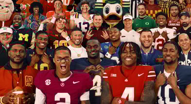
It is ubiquitous now, that beautiful Block “C” Gamecock logo. Within the State of South Carolina, certainly, but throughout the Southeast and well beyond. You see it in airports, emblazoned upon the t-shirts and polos of passing commuters; on bumper stickers, on hats and yard flags, and all manner of paraphernalia. I’ve seen it from a distance, proudly donned by fellow travelers from the wilds of Yellowstone to the bustling boulevards of London and Paris.
When you see it, particularly outside of the Palmetto State, you know you’re not so much a stranger in a strange land as you are amongst friends. Logos build identity and foster community. They are powerful symbols of clannish belonging. They’re also spectacularly lucrative symbols, with licensed sports merchandise accounting for a staggering $35 billion in US sales during 2024.
In 2016, my wife Melissa and I traveled to Hawaii to attend a confirmation ceremony for an industry designation she had completed. Following a few days at the conference in Honolulu, we island-hopped, extending the trip for a bit in Maui. After a night in the funky, cool town of Paia, we set off in a rented Jeep for the iconic drive along the Road to Hana.
Arriving after a spectacular but hours-long drive along winding blacktop, we were eager to stretch our legs and ventured out for a walk around the village. Gorgeous as it is, Hana is small and remote, with a population hovering around a thousand permanent residents.
You might imagine our surprise and delight when, during our walk, we saw a total of two team flags flying proudly from a couple of low-slung brick bungalows. One, a Green Bay Packers flag – Melissa is a Wisconsin native, who rescued me from a lifetime of Falcons fandom.
The other? A striking garnet Gamecock flag, fluttering as casually in the Polynesian breeze as if it were in Shandon.
A Packers flag and a Gamecock flag in remote, thousand-resident Hana. After what had been a tough year, the sightings were transcendent – a hug from the cosmos and a reassurance that things were going to be ok. For that, Hana will always be special.
Such is the power of logos.
Which gets me thinking about the Gamecock logo in particular, and how it has evolved over time.
A new mascot begets the need for a logo
When the University of South Carolina first fielded football and baseball squads in the 1890s, teams competed under a number of different nicknames, primarily “College Boys,” and “Jaguars.”
By 1902, those nicknames lost traction in favor of “Gamecocks.” It was a nod to Revolutionary War hero Thomas Sumter of South Carolina, known as the “Fighting Gamecock,” for the ferocity of his fighting against the forces of British general Banastre Tarleton. Newspaper coverage of earlier Carolina football victories had also described the team’s efforts as “like that of fighting game cocks.”
In the fall of that year, following a stirring 12-6 upset by Carolina over a powerful Clemson squad in the annual State Fair week grudge match, the conditions were ripe for calamity.
Take a toxic history between two state colleges, the stimulating elements of a violent game, a resounding upset leading to unbridled jubilation on one side, and 400 armed and angry cadets on the other. Mix in youthful indiscretion and perhaps some illicit sipping of contraband hootch amid the garish spectacle of a carnival atmosphere. Downtown Columbia was an oxygen-rich environment during that October weekend of 1902. A simple spark would set it all off.
The spark came in the form of a drawing by F. Horton Colcock, a professor at the University of South Carolina, which was at the time chartered as South Carolina College. The large drawing, which papers described as a “transparency,” hung in the window of a Main Street tobacco merchant, depicting a bedraggled tiger prostrate beneath a crowing gamecock. Innocuous under normal circumstances, the transparency set off a chain of events in that charged atmosphere, which led to the brink of an armed battle at the gates of USC’s normally tranquil Horseshoe.
Following that infamous uproar, the Gamecock was firmly entrenched in hearts and lore as the university’s mascot. From there, a decades-long evolution of the Gamecock logo began.
In August 1986, columnist Dan Lackey penned an article in The State covering that evolution. The early Gamecocks were nondescript roosters, crowing or strutting in some fashion. Generic barnyard portrayals, not officially sanctioned by the university. Lackey’s piece included several images from across the 20th Century, among them, this jaunty fellow from 1913:
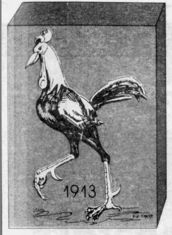
Early 20th Century Gamecock logo – hardly intimidating
By the late 1950s, officials with the Gamecock Club approached Jack Smyrl, a staff artist with The State from 1947 to 1986, about drawing an image they could print on memorabilia for club events. Smyrl obliged, creating the first official Gamecock logo, for which he was paid the princely sum of $10. The Smyrl rooster was a more aggressive bird in a fighting posture, wings spread, spurs up, and poised for combat.
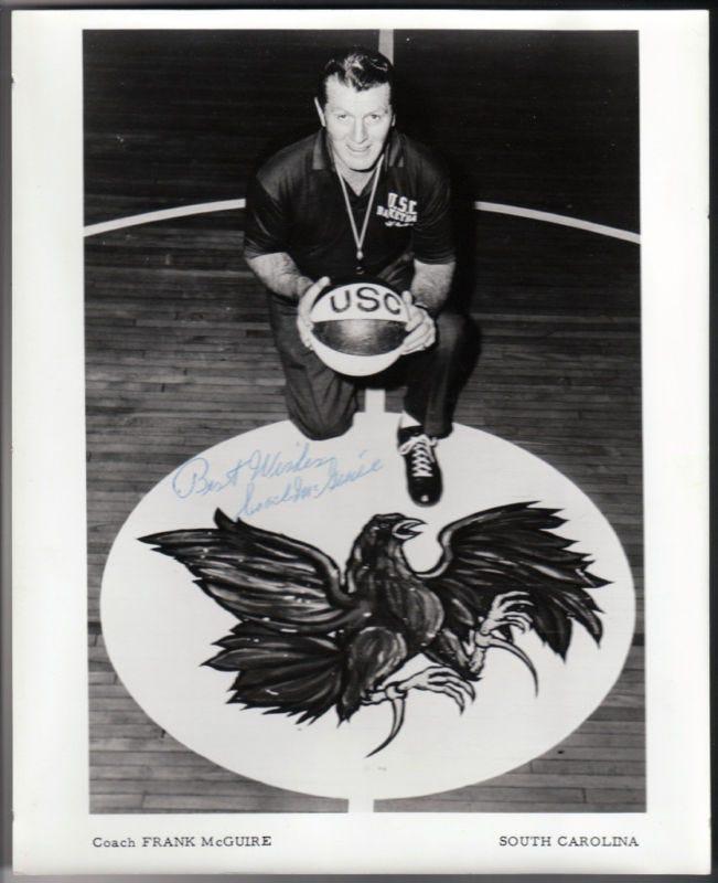
Coach Frank McGuire at Carolina Fieldhouse in a 1960’s promotional photo
The logo adorned mid-court of the Carolina Fieldhouse during the final decade of that building’s existence and served as the official Gamecock logo until the arrival of head football coach and athletics director Paul Dietzel in 1966.
“Something more defiant-looking” – The Dietzel bird
Dietzel made it an early priority upon coming to Columbia to update the Gamecock logo with an even more striking visual image. An accomplished artist himself, Dietzel possessed a flair for creative branding. He secured the services of artists at Columbia’s R.L. Bryan Company to draw an updated Gamecock logo, with vague instructions for “something more defiant looking.”
The updated image presented a more aggressive bird in advancing posture, facing left to right, with tail feathers flowing behind. Its lower claw clutched a streaming banner bearing the words “Scholarship-Leadership.
Top 10
- 1New
2025-26 CFP, Bowls
Full schedule, times, TV released
- 2Trending
Super Regionals Odds
Betting lines for each Super
- 3
CFP Title Favorites
Ranking Top 20 to win it all
- 4Hot
Chipper Jones
Calls out Kevin O'Sullivan, Georgia baseball
- 5
Ryan Day
Calls for 4 Big Ten CFP bids
Get the On3 Top 10 to your inbox every morning
By clicking "Subscribe to Newsletter", I agree to On3's Privacy Notice, Terms, and use of my personal information described therein.
Legend has it that Dietzel’s initials were craftily incorporated into the Gamecock’s tail feathers. Was it a sly tribute by the artist to Dietzel, or did the coach tweak the original design? Andy Demetra, a former radio voice of Gamecock basketball and baseball broadcasts, penned an article for his “Inside the Chart” series in the Oct. 2, 2013, edition of Spurs & Feathers Magazine exploring the myth. Unfortunately, Dietzel passed away in September of that year before Demetra was able to secure the details.
The full answer may be obscured by time and uncertainty, but the “PD” does come into focus among the upper tail feathers and remains a fitting tribute to the man most responsible for modernizing Gamecock athletics in the 1960s and 70s.
The Block “C”
Carolina’s Block “C” had long been associated with athletics branding at USC. It appeared on lettermen’s jackets, and could be found on various publications, from game programs to media guides. It was sometimes a stand-alone image, other times combined with the official Smyrl or Dietzel Gamecock logos, effectively working as an alternate or secondary logo.
The Gamecock Club in particular used the Block “C” in their promotional ads and brochures, as seen below from 1965 (left) and 1972.
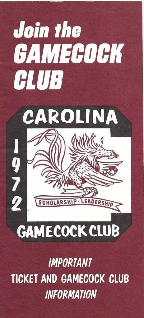
Gamecock Club ads incorporating the Block “C” from 1972
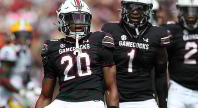
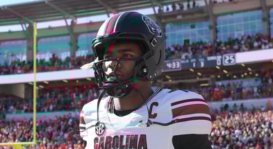
When Jim Carlen replaced Dietzel as head football coach and athletics director in December 1974, team dentist Bill Smith, a side-hustling graphic artist, assisted with updating Dietzel’s logo. Smith ditched the banner and framed the Gamecock with a bold Block “C” outlined in garnet trim. The update debuted on USC’s revamped football helmets during the 1975 season, and remains in use today with only subtle tweaks.
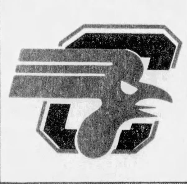
Some over the years have proposed simplification of the logo. Notably, Lewis Brierly, a professor of graphic arts at USC, promoted a more streamlined logo in 1983. Brierly claimed, not incorrectly, that when reduced in size or seen from a distance, the Gamecock logo became a “blob.” The logo “had all the personality of a Gamecock,” Brierly explained, “but none of the thrust.”
Logo update proposed by USC professor Lewis Brierly in 1983
The State’s editorial staff panned the proposed logo update in an Oct. 14, 1983, piece titled “Logo for the Birds?,” noting,
“We make no claim to an understanding of “thrust” or the fine points, or even the broader ones, of graphic art. But… in all that thrust, we see something like a demented, high-tech rooster,” while noting that if Brierly’s “bit of fowl play is accepted and inspires the chickens onto victory, we’ll gladly eat crow and change our ballot.”
With respect to professor Brierly’s noble efforts, most will agree it is a good thing his logo was “thrust” into oblivion.
50 years and going strong
The current Gamecock logo is essentially the Carlen-era version with minor tweaks – a bit more stylized, a tad more streamlined. Note the more detailed, and in my estimation, more fierce-looking, Carlen-era version (left), compared with the more simplified logo now trademarked by the university.
 |  |
Carlen-era Gamecock (left), and the logo currently in use
Differences in the two would be lost on the casual observer, though if you’ve read this far, it’s safe to say you’re no mere casual observer. The current Gamecock, for all intents and purposes, is the same logo in use now for five decades, and that’s a beautiful thing.
Given the barnyard portrayals of those early decades; the ego-driven, coach-by-coach reworking of the Dietzel and Carlen eras; and 1983’s update that thankfully never came to fruition, the logo we have will do just fine for the next 50 years and beyond.
That bold Block “C” is instantly recognizable anywhere you go, from the boulevards of Paris, to the porches of Hana, to the timeworn, beer-splashed haunts of Five Points.
So, cheers to that venerable old rooster on his 50th year!
Forever to Thee, friends.


