Let the gnashing of teeth begin
- Thread starter The Peeper
- Start date
You are using an out of date browser. It may not display this or other websites correctly.
You should upgrade or use an alternative browser.
You should upgrade or use an alternative browser.
As long as that damn white hat is not a part of it.
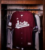
Looks better on a baseball uniform than football.
Yep. I like it. Anything to sh1tcan the banner M is progressLooks better on a baseball uniform than football.
I can see it now. I'm gonna be the last m17er in the world driving around with a Banner M Alumni sticker on my truck back window. Reverse trendsetter.Yep. I like it. Anything to sh1tcan the banner M is progress
I just always thought it looked like Michigan’s M and thought the Baseball M over S was our brand. The fact it came during the croom vroom years didn’t help. My first association with the banner M was watching a superstar Jerious Norwood struggle on some of the worst coached teams ever fielded.I can see it now. I'm gonna be the last m17er in the world driving around with a Banner M Alumni sticker on my truck back window. Reverse trendsetter.
I like it on baseball jerseys, mainly the gray one. I do think this one looks kinda shltty. I like the M over S on maroon, honestly.Goat:

I'm a little more pragmatic. I don't care what we have on. I just want to win.
I'll say &tate looks decent on the baseball jersey, it did in 2021 and 1971. However I am not buying a damn thing with &tate. Because of what Shitasses some &tate fans are about the "Banner M".I can see it now. I'm gonna be the last m17er in the world driving around with a Banner M Alumni sticker on my truck back window. Reverse trendsetter.
I'm stocking up on "Banner M"
The way you got “shitasses” through the filter has persuaded me to re-evaluate my stanceI'll say &tate looks decent on the baseball jersey, it did in 2021 and 1971. However I am not buying a damn thing with &tate. Because of what Shitasses some &tate fans are about the "Banner M".
I'm stocking up on "Banner M"
on how I spell curses here. Banner M blows.
&tate is effeminate and weak. Looks fine on all female sports uniforms. Barely looks good on baseball. Probably because it’s the least masculine of the big three sports. With football being the most masculine, &tate looks the worst and is embarrassing.
Yup, let's win something first, then we can ***** about the little stuff laterI'm a little more pragmatic. I don't care what we have on. I just want to win.
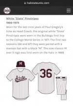
What is the issue? We’ve been wearing that logo on our baseball jerseys for years. A variation of that logo dates back to the 50s and that exact logo dates back to the 60s.
I like it, I'm just amusing the many that don'tWhat is the issue? We’ve been wearing that logo on our baseball jerseys for years. A variation of that logo dates back to the 50s and that exact logo dates back to the 60s.
I think we should put on a fashion show and have the players walk the runway and swish around in the various uniforms so most of you guys can fawn about the exquisite style and color matching.
Any time there are logo threads, I think the people who complain the most must never attend games. If you go to any of the big three, especially in cooler weather, you will see every MSU logo produced since 1985 plus “maroon is all that matters” represented.
If walking bully on a crimson jacket is your thing, you can rock that puppy forever. Nobody is going to take it away from you. I have long since accepted the fact that we will always have 27 different logos roaming around on game day, and our fans will never unite on that front. Heck, we give shirts away at games, and our fans are like, “They can’t tell me what to wear! I’ll save this for 2036.”
If walking bully on a crimson jacket is your thing, you can rock that puppy forever. Nobody is going to take it away from you. I have long since accepted the fact that we will always have 27 different logos roaming around on game day, and our fans will never unite on that front. Heck, we give shirts away at games, and our fans are like, “They can’t tell me what to wear! I’ll save this for 2036.”
Not a basketball fan, huh?I just always thought it looked like Michigan’s M and thought the Baseball M over S was our brand. The fact it came during the croom vroom years didn’t help. My first association with the banner M was watching a superstar Jerious Norwood struggle on some of the worst coached teams ever fielded.
The banner M has grown on me. When we first rolled it out I was excited that we were changing logos, but a little disappointed it looked do much like Michigan's logo. Now I like it, and it is recognizable to others, especially in the South.
Sportswise, I associate it with some of the most successful moments in our history.
The issue isn't the various logos. People are free to wear what they want. Hell, i like MS and &tate for baseball. I like MState for football It is Cohen and now &elmon making &tate the logo of Mississippi State athletics. &tate is good on a shirt or jersey, weak as a stand alone representation of the university.Any time there are logo threads, I think the people who complain the most must never attend games. If you go to any of the big three, especially in cooler weather, you will see every MSU logo produced since 1985 plus “maroon is all that matters” represented.
If walking bully on a crimson jacket is your thing, you can rock that puppy forever. Nobody is going to take it away from you. I have long since accepted the fact that we will always have 27 different logos roaming around on game day, and our fans will never unite on that front. Heck, we give shirts away at games, and our fans are like, “They can’t tell me what to wear! I’ll save this for 2036.”
also people like in this thread and Brian Hadad. I get it people have different taste. But when every time you have a commercial or an opinion on another logo, you take the opportunity to crap on the Banner M in a public forum, well that creates resentment.
It's way of the sports world now.I think we should put on a fashion show and have the players walk the runway and swish around in the various uniforms so most of you guys can fawn about the exquisite style and color matching.
Here ya go.....
I'm fine with the updated Banner M because it looks cleaner. The original Ribbon M sucked balls. I'd prefer the Banner M over &tate but nobody pays me to decide so I'll shut up and just wear camo
Bingo. It wasn’t even Cohen who started it, it was the fans. We all liked STATE and the &tate was born out of the 2021 national title. It should have just stayed there, on merch and the occasional helmet.The issue isn't the various logos. People are free to wear what they want. Hell, i like MS and &tate for baseball. I like MState for football It is Cohen and now &elmon making &tate the logo of Mississippi State athletics. &tate is good on a shirt or jersey, weak as a stand alone representation of the university.
also people like in this thread and Brian Hadad. I get it people have different taste. But when every time you have a commercial or an opinion on another logo, you take the opportunity to crap on the Banner M in a public forum, well that creates resentment.
I have no idea who exactly is behind the recent push but it started under Selmon. To me it represents the group of fans who want to continue to do the same things we’ve always done. The RuN dA bAwL crowd. The ones who have no idea what’s truly best for MSU.
I'm still rolling with the humping bully BDC sticker in my back window.I can see it now. I'm gonna be the last m17er in the world driving around with a Banner M Alumni sticker on my truck back window. Reverse trendsetter.
For you youngens, although the banner M did start in football with Croom, it actually had it's beginnings with the mid 90's Final Four basketball teamI just always thought it looked like Michigan’s M and thought the Baseball M over S was our brand. The fact it came during the croom vroom years didn’t help. My first association with the banner M was watching a superstar Jerious Norwood struggle on some of the worst coached teams ever fielded.
It's way of the sports world now.
Here ya go.....
The black with maroon writing with that ugly white front hat that Holcombe is wearing is hideous. I'd rather have the "Nickle Blacks" back
You left out these people are mouth breathers.Bingo. It wasn’t even Cohen who started it, it was the fans. We all liked STATE and the &tate was born out of the 2021 national title. It should have just stayed there, on merch and the occasional helmet.
I have no idea who exactly is behind the recent push but it started under Selmon. To me it represents the group of fans who want to continue to do the same things we’ve always done. The RuN dA bAwL crowd. The ones who have no idea what’s truly best for MSU.
I did notice my bulldog club packet arrived with the M over S sticker. Hopefully that’s a good sign. I hate the script state and will not wear it. Looks Wal Martsy
Yes. I recall. I’m pushing 50.For you youngens, although the banner M did start in football with Croom, it actually had it's beginnings with the mid 90's Final Four basketball team
To your point, if YOU recall, the banner M was so awesome and memorable, they put the wrong team name on the Final Four tourney hats.
Check.
The word 'State' isnt misspelled. Thats my GAS level here.
Looks fine and I wouldnt think twice to see players in a game wearing it.
Ill leave the fashion critiquing to those on the board who secretly wish they were a contestant on Next in Fashion.
Looks fine and I wouldnt think twice to see players in a game wearing it.
Ill leave the fashion critiquing to those on the board who secretly wish they were a contestant on Next in Fashion.
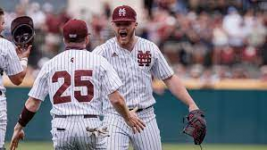
I like those or the solid whites. Then the maroon MS ones and/or the 85 ones. Then gray can be &tate.This should be our permanent home uniforms:
View attachment 529318
What does that have to do with the banner M?Yes. I recall. I’m pushing 50.
To your point, if YOU recall, the banner M was so awesome and memorable, they put the wrong team name on the Final Four tourney hats.
Check.
Get unlimited access today.


