No argument here
- Thread starter retire the banner
- Start date
You are using an out of date browser. It may not display this or other websites correctly.
You should upgrade or use an alternative browser.
You should upgrade or use an alternative browser.

Are you down wIth the whole list or just our entry? Obviously the producer of this list hates single initials and loves mascot graphics.
For my tastes I am not too crazy about the gator logo and the washington state logo is hideous.
For my tastes I am not too crazy about the gator logo and the washington state logo is hideous.
I don’t agree with all of them. BYU’s isn’t terrible.Are you down wIth the whole list or just our entry? Obviously the producer of this list hates single initials and loves mascot graphics.
For my tastes I am not too crazy about the gator logo and the washington state logo is hideous.
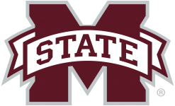
Tbh, our logo might be the worst on the list. Just awful.
It’s like they picked those out of a hat. The BYU and Syracuse logos are great. And ours is just fine. And there’s nothing special about Clemson.
I really don't understand the hate for this logo. Can you explain what's awful about it?Tbh, our logo might be the worst on the list. Just awful.
Our logo isn’t “just fine”. It’s bad.It’s like they picked those out of a hat. The BYU and Syracuse logos are great. And ours is just fine. And there’s nothing special about Clemson.
Need to go script full time. This is the way
BAD:
Attachments
-
 IMG_1345.png190.7 KB · Views: 3
 -
 IMG_1346.png5 KB · Views: 3
Tons of Clickbate Evidence Here. Time to Go to Straight STATE or The Cursive Version. Should Go Over Like a Lead Zeppelin.

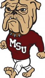
I know this is all opinion but if you think Walking Bully is an example of a good logo, I seriously question your taste.GOOD:
Walking Bully is an excellent logo. I’m not saying it should be our primary, but it should replace that s h i t generic bulldog logo created during the Byrne/Strickland eraI know this is all opinion but if you think Walking Bully is an example of a good logo, I seriously question your taste.
Walking Bully is not that great. It’s dated.
Walking Bully =I know this is all opinion but if you think Walking Bully is an example of a good logo, I seriously question your taste.

I don't disagree, I've never liked the banner, or Stricklin for forcing it down our throats because some marketing student told him it was fresh and contemporary
Actually, if I remember correctly Richard Williams was the one that came up with the Banner M. It took us a while to make it the primary logo though. I don't mind it at all. THE best one was the old script interlocking MSU.I don't disagree, I've never liked the banner, or Stricklin for forcing it down our throats because some marketing student told him it was fresh and contemporary
Walking bully has it's place. I've got a sticker on my cowbell. I could see wearing a walking bully tshirt or cap that I wear to work around the house. But it's not something you'd want on a gameday polo or uniformsWalking Bully is not that great. It’s dated.
We have better looks. Script state, m over s, walking bully, interlocking ms are all examples of better lookeI really don't understand the hate for this logo. Can you explain what's awful about it?

University of Mississippi land shark logo. I thought it was just a one-off thing, but they had them on sideline gear this season. Worst logo in sports IMO.What exactly is that?
According to you our baseball is a waste of time and money. I can't wait for you to tell us something else that you don't like about MSU.I don’t agree with all of them. BYU’s isn’t terrible.
Tbh, our logo might be the worst on the list. Just awful.
That doesn’t actually answer my original question, though. What is it about our current logo that’s “bad?”We have better looks. Script state, m over s, walking bully, interlocking ms are all examples of better looke
I can hear him saying it in my head I’ve heard it so many times. #AVGN
That doesn’t actually answer my original question, though. What is it about our current logo that’s “bad?”
The fact that this argument breaks out once a week and at least half of this board despises the banner M is all you need to know. I’ve never heard an Ole Miss fan say the hate the script ole miss, a Bama fan say they hate the script A, and Auburn fan say they hate the A over U, etc. If half your fan base hates your logo, it’s time to maker a change.
Walking Bully is a freaking abomination. There’s no way you can be serious about that. It’s not even a good “throw back” Bulldog logo. I could post 4-5 older Bully logos that blow that 80’s monstrosity out of the water. It’s either misplaced nostalgia or a case of just plain old bad taste.GOOD:
Have you ever had Portuguese Chicken?Walking Bully is a freaking abomination. There’s no way you can be serious about that. It’s not even a good “throw back” Bulldog logo. I could post 4-5 older Bully logos that blow that 80’s monstrosity out of the water. It’s either misplaced nostalgia or a case of just plain old bad taste.
That’s a really good point. I never thought of it that way. The problem is the administration is 100% invested in using the banner M as the university-wide logo. That’s a lot of signage, letterhead, graphics, etc that will have to be replaced if we move to a new logo.The fact that this argument breaks out once a week and at least half of this board despises the banner M is all you need to know. I’ve never heard an Ole Miss fan say the hate the script ole miss, a Bama fan say they hate the script A, and Auburn fan say they hate the A over U, etc. If half your fan base hates your logo, it’s time to maker a change.
For the record, I like the Banner M, but I’m not married to it. It was a light year improvement over the early 2000s logo.
Because he is Robbie Faulk and a complete DBI really don't understand the hate for this logo. Can you explain what's awful about it?
Shut up, HotMopHave you ever had Portuguese Chicken?
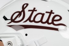
The Cleftate is so incredibly stupid.
State is such a generic term. Dr Pepper uses "State" for a fictional university.
Michigan State has used a very similar logo since the 1970s.
A cursive word for a logo.... what imagination.*
Look y'all are getting played to buy more shirts and hats. I ain't buying that stupid *** Cleftate.
State is such a generic term. Dr Pepper uses "State" for a fictional university.
Michigan State has used a very similar logo since the 1970s.
A cursive word for a logo.... what imagination.*
Look y'all are getting played to buy more shirts and hats. I ain't buying that stupid *** Cleftate.
Marketing student? You do know the administration hired a well known marketing firm to rebrand the entire university, right?I don't disagree, I've never liked the banner, or Stricklin for forcing it down our throats because some marketing student told him it was fresh and contemporary


You are 100% correct. We need better fans!The fact that this argument breaks out once a week and at least half of this board despises the banner M is all you need to know. I’ve never heard an Ole Miss fan say the hate the script ole miss, a Bama fan say they hate the script A, and Auburn fan say they hate the A over U, etc. If half your fan base hates your logo, it’s time to maker a change.
LolAccording to you our baseball is a waste of time and money. I can't wait for you to tell us something else that you don't like about MSU.
A lot of hate for the walking bully. I think it’s a great secondary logo when a bulldog/mascot is needed. Certainly not saying it should be the primary logo.
So what happens if we make a change and half the people on this board hate whatever logo we change to?The fact that this argument breaks out once a week and at least half of this board despises the banner M is all you need to know. I’ve never heard an Ole Miss fan say the hate the script ole miss, a Bama fan say they hate the script A, and Auburn fan say they hate the A over U, etc. If half your fan base hates your logo, it’s time to maker a change.
It looks like the off-season threads are kicking in since baseball sux balls.
Gonna be a long summer.
Gonna be a long summer.
 . Or put white btw the two. Looks so much better.
Latest posts
-
 Fast charging EV station in Starkville
- Latest: 3000lbchicken
Get unlimited access today.