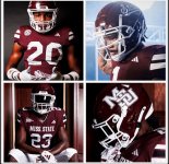
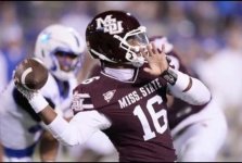
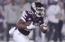
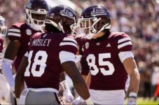
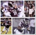
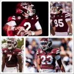
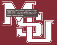
POLL: Football Uniforms
- Thread starter DawgSZN12
- Start date
You are using an out of date browser. It may not display this or other websites correctly.
You should upgrade or use an alternative browser.
You should upgrade or use an alternative browser.
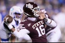
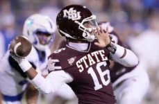
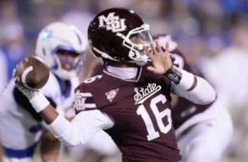
interlocking MSU on the Helmets, STATE along the Chest.
Either is 10x better than the MState banner on our football uniforms.
Either is 10x better than the MState banner on our football uniforms.
2nd pic, but make the STATE a little smaller.
That looks awesome.
that's it! Print it
MST3K will always get a thumbs upNeed as many votes as we can muster up.
I miss me some Tom Servo and Crow.MST3K will always get a thumbs up
I miss me some Tom Servo and Crow.
Now do 2004-2008 Banner M
One win better than 01-03.Now do 2004-2008 Banner M
What was that 2023 score v Kentucky ?
Well I sure hope we had more wins over 5 years compared to 3 lol. So you’re just going to completely ignore when we had the interlocking from 1996-2000?One win better than 01-03.
What was that 2023 score v Kentucky ?
Whether we won 3 games or 9 games. Idgaf, interlocking is the best look we have. Because the last couple of years were bad under Sherrill you don’t like it? Not sure I follow your line of thinking
Sadly, we’ve had a lot of really bad seasons with literally every helmet logo we’ve ever used.Well I sure hope we had more wins over 5 years compared to 3 lol. So you’re just going to completely ignore when we had the interlocking from 1996-2000?
Whether we won 3 games or 9 games. Idgaf, interlocking is the best look we have. Because the last couple of years were bad under Sherrill you don’t like it? Not sure I follow your line of thinking
Exactly. That’s why I don’t get Maroon13’s post about the last years of Sherrill being a reason against wearing interlocking.Sadly, we’ve had a lot of really bad seasons with literally every helmet logo we’ve ever used.
Maroon13 had to have been on the graphic team that developed the ugly maroon butterfly. He's one of the only people I've seen across multiple message boards that fights for the thing. Sorry buddy, it's dead and isn't coming back
Personally, I like the banner M-State a little better than the MSU. But, as the results of this poll make clear, the vast majority of our fans want the MSU and don’t like the script &tate. A smart AD would change back to the MSU immediately. But of course we won’t.Maroon13 had to have been on the graphic team that developed the ugly maroon butterfly. He's one of the only people I've seen across multiple message boards that fights for the thing. Sorry buddy, it's dead and isn't coming back
The State script is very generic and sucks......Selmon may become the best athletic director that ever lived. but sticking by the State script will always tarnish his legacy.
Sorry, I have to respectfully disagree with you regards the MState banner. I think it created a distinctive identity and always liked it. That's not to say that I dislike the interlocking MSU logo, nor do I dislike the "State" across the top of the shirts. I will say that the script "State" on the helmets does absolutely nothing for me. It is totally bland and will not distinguish us from any number of "_____ State" schools across the country. Can we not EVER settle on a permanent identity and stick to it?????interlocking MSU on the Helmets, STATE along the Chest.
Either is 10x better than the MState banner on our football uniforms.
The MSate Banner looks great of letter head and "ok" on basketball.Sorry, I have to respectfully disagree with you regards the MState banner. I think it created a distinctive identity and always liked it. That's not to say that I dislike the interlocking MSU logo, nor do I dislike the "State" across the top of the shirts. I will say that the script "State" on the helmets does absolutely nothing for me. It is totally bland and will not distinguish us from any number of "_____ State" schools across the country. Can we not EVER settle on a permanent identity and stick to it?????
I honestly don’t care what we put on the helmet. We can change it every game for all I care. Uniforms are fickle, especially for a program with as little tradition as ours. Obviously baseball has more of that, so we should lean into it.
I just want the banner M (the modern block official school logo) on the 50 yard line, outside the stadium and on the basketball court. I don’t know if there is a logo on the outside of the Hump and Dude, but if it is, that should be banner M too.
&tate should be on nothing but merch and the occasional uniform. It serves its purpose, but it should not be our official athletics logo. It’s a good thing to have your official university logo match the overall athletic logo.
This seems really straight forward to me and I’ve been crowing about it for years. It’s like our fans don’t want to understand branding. This stuff matters.
Why do you use only 5 years of the Croom era and ignore the Mullen era?Exactly. That’s why I don’t get Maroon13’s post about the last years of Sherrill being a reason against wearing interlocking.
Which if I want to be technical, the current "Banner M" isn't the 04-08 Banner M. But I've told you that and you "don't get it. "
Wrong. The Banner M is all over the campus at this very moment. On the university website and some sports uniforms.Maroon13 had to have been on the graphic team that developed the ugly maroon butterfly. He's one of the only people I've seen across multiple message boards that fights for the thing. Sorry buddy, it's dead and isn't coming back
&tate is a novelty and will be gone shortly after &elmom.
I agree. But the majority wants MSU. No reasons not to give it to them. Permanently.Sorry, I have to respectfully disagree with you regards the MState banner. I think it created a distinctive identity and always liked it. That's not to say that I dislike the interlocking MSU logo, nor do I dislike the "State" across the top of the shirts. I will say that the script "State" on the helmets does absolutely nothing for me. It is totally bland and will not distinguish us from any number of "_____ State" schools across the country. Can we not EVER settle on a permanent identity and stick to it?????
Get unlimited access today.
