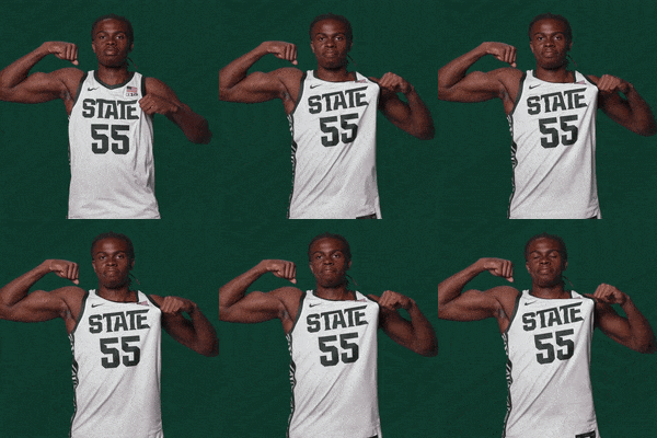
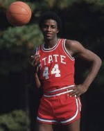
RUMOR: The Mississippi State banner is gone from the basketball uniforms
- Thread starter 615dawg
- Start date
You are using an out of date browser. It may not display this or other websites correctly.
You should upgrade or use an alternative browser.
You should upgrade or use an alternative browser.
Block State all damn day.

Block State all damn day.

I could do without the bigass adidas logoBlock State all damn day.
Will we also bring back the silver home uniforms?Block State all damn day.
I think that may solve itself doesn't our contract with the run out soon? Maybe we could be trend setter and go with Riddle or Russell Athletic, maybe Converse?*** And I agree.I could do without the bigass adidas logo
Chuck Taylors for everybody!!I think that may solve itself doesn't our contract with the run out soon? Maybe we could be trend setter and go with Riddle or Russell Athletic, maybe Converse?*** And I agree.
Thx. just booked hotel in San Antonio for early April.
I don't mind either uniform, honestly, even though I really don't like &tate on anything other than a baseball jersey. It's tolerable on basketball uniforms (especially women's), and horrible on helmets. Block STATE looks pretty good, and could be on the helmets too, in my mind.
I REALLY hate the &tate on the walls, fields, stadiums, and everywhere else they are putting it to replace our 25-year old, most successful athletic symbol, and university official logo.
I REALLY hate the &tate on the walls, fields, stadiums, and everywhere else they are putting it to replace our 25-year old, most successful athletic symbol, and university official logo.
How much did Dr. Pepper give to our NIL for this?
State is a Michigan State thing in basketball. I wish we would go with a simple Mississippi State pretty much like the 1996 look
Block STATE on football jerseys, with banner Mstate on helmets (2015)
New Balance!I think that may solve itself doesn't our contract with the run out soon? Maybe we could be trend setter and go with Riddle or Russell Athletic, maybe Converse?*** And I agree.
We are officially all in on one of the ugliest logos in sports.
State is a Michigan State thing in basketball. I wish we would go with a simple Mississippi State pretty much like the 1996 look
Eh, that part doesn't bother me too much. Leaning into 'State' is a good thing. But doing it with & is stupid.I found the white version.... oh no wait.... that is .... which State again?
I agree. The "&" is awful. I don't mind State on a uniform. I'm pretty sure we had that same font State and just State on the basketball uniform in Richard Williams first few years.Eh, that part doesn't bother me too much. Leaning into 'State' is a good thing. But doing it with & is stupid.
But my post was in response to the "branding as State" line trotted out by somebody. I assume &elmon.
For the 100x time getting rid of the descriptive, unique logos and going with "&tate" on all things to "brand as State" is dumb AF. It's like if Coke or Pepsi decided to brand as "cola".
Zac Selmon Efron needs to go all in on partnering with DP, change the name of the junction to Fansville, etc.
I'm telling you man, it makes me so damn mad. It's one of the reason why I've had to wash my hands of a lot of things re-MSU. Our fans don't understand how important branding really is. To them, it's just another change, as we've done throughout our (unsuccessful) history.But my post was in response to the "branding as State" line trotted out by somebody. I assume &elmon.
For the 100x time getting rid of the "banner M" and going with "&tate" on all things to "brand as State" is dumb AF. It's like if Coke or Pepsi decided to brand as "cola".

New MSU athletic branding taking hold
One of Zac Selmon’s first priorities upon taking over as Mississippi State athletic director was ensuring the school and its sports teams had an easily recognizable and identifiable brand.
 cdispatch.com
Reading that, you'd think it's all Salmon. But it's not - it started with Keenum. Once we won that national title, of course we're going to get all inferior, think he need to change again, and try and go all-in with that &tate and abandon our solid, recognizable logo that serves academics AND athletics, an obvious advantage. But NOPE. And the &tate it looks like Ole Miss, who is obviously our idols in the eyes of the inferior segment of our fanbase (apparently the majority). And honestly, it was fine to experiment with it a little bit, which we did in 2021 and 2022. But Cohen had about put the clamps on it as the official athletics logo, because he had a brain. But once he was out of the picture, Keenum pushed it again and got Salmon to carry it out.
It's a damn shame. So much self-affliction. People say we need to pick a logo and stick with it. WE HAD DONE THAT, FOR 25 DAMN YEARS.
100% agree, can't wait for them to go but that damn M State banner was almost as badI could do without the bigass adidas logo
Akshooahly, it’d be similar if we went with “University“. What MSU is doing is the equivalent of Coca-Cola going with “Coke”.I agree. The "&" is awful. I don't mind State on a uniform. I'm pretty sure we had that same font State and just State on the basketball uniform in Richard Williams first few years.
But my post was in response to the "branding as State" line trotted out by somebody. I assume &elmon.
For the 100x time getting rid of the descriptive, unique logos and going with "&tate" on all things to "brand as State" is dumb AF. It's like if Coke or Pepsi decided to brand as "cola".
I heard FILA is looking to get in the college sports world.....I think that may solve itself doesn't our contract with the run out soon? Maybe we could be trend setter and go with Riddle or Russell Athletic, maybe Converse?*** And I agree.
Oh I understand how important branding is, which is why we needed a change from a logo that was constantly tweaked over 25 years bc of how bad it was. The only thing recognizable about the banner M was:I'm telling you man, it makes me so damn mad. It's one of the reason why I've had to wash my hands of a lot of things re-MSU. Our fans don't understand how important branding really is. To them, it's just another change, as we've done throughout our (unsuccessful) history.

New MSU athletic branding taking hold
One of Zac Selmon’s first priorities upon taking over as Mississippi State athletic director was ensuring the school and its sports teams had an easily recognizable and identifiable brand.cdispatch.com
Reading that, you'd think it's all Salmon. But it's not - it started with Keenum. Once we won that national title, of course we're going to get all inferior, think he need to change again, and try and go all-in with that &tate and abandon our solid, recognizable logo that serves academics AND athletics, an obvious advantage. But NOPE. And the &tate it looks like Ole Miss, who is obviously our idols in the eyes of the inferior segment of our fanbase (apparently the majority). And honestly, it was fine to experiment with it a little bit, which we did in 2021 and 2022. But Cohen had about put the clamps on it as the official athletics logo, because he had a brain. But once he was out of the picture, Keenum pushed it again and got Salmon to carry it out.
It's a damn shame. So much self-affliction. People say we need to pick a logo and stick with it. WE HAD DONE THAT, FOR 25 DAMN YEARS.
1. its A is off-center
2. It looks like a butterfly
3. It consistently ended up on worst logo lists
The whole thing of “consistency” being a good thing goes out the window when the branding is garbage. And you saying that John Cohen had a brain instantly negates any point you’re trying to make.
We’re not a corporation, we’re an athletics program that needs to make its target market that’s been with it and will be with it, happy. Which changing that logo clearly did bc you see people buying the script in bulk.
I've never seen our fanbase more disengaged than they are right now. Compared to our peers, we are in Croom territory. The only things savings us at the moment are SEC money and Chris Jans (and he will likely leave as soon as he can).Oh I understand how important branding is, which is why we needed a change from a logo that was constantly tweaked over 25 years bc of how bad it was. The only thing recognizable about the banner M was:
1. its A is off-center
2. It looks like a butterfly
3. It consistently ended up on worst logo lists
The whole thing of “consistency” being a good thing goes out the window when the branding is garbage. And you saying that John Cohen had a brain instantly negates any point you’re trying to make.
We’re not a corporation, we’re an athletics program that needs to make its target market that’s been with it and will be with it, happy. Which changing that logo clearly did bc you see people buying the script in bulk.
You serious? You must not have been a fan for that long. And that has what to do with branding? Actually your boy Cohen is responsible for the valley we’re currently in. I’d list all the reasons but I’m not sure it can handle all the text.I've never seen our fanbase more disengaged than they are right now. Compared to our peers, we are in Croom territory. The only things savings us at the moment are SEC money and Chris Jans (and he will likely leave as soon as he can).
It's all tied together - morale, image, perception. Only the mouth breathers don't understand that.You serious? You must not have been a fan for that long. And that has what to do with branding? Actually your boy Cohen is responsible for the valley we’re currently in. I’d list all the reasons but I’m not sure it can handle all the text.
Everyone hated that butterfly logo so my point stands.It's all tied together - morale, image, perception. Only the mouth breathers don't understand that.
Latest posts
-
-
-
Speaking of alphaguess... (damn you, dorn**)
- Latest: Darryl Steight
-
Get unlimited access today.


