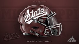
Should this be our helmet for next season?
- Thread starter Ranchdawg
- Start date
You are using an out of date browser. It may not display this or other websites correctly.
You should upgrade or use an alternative browser.
You should upgrade or use an alternative browser.
I’m all for it. I also think we should pull out the flying M again as well. The baseball interlocking MS should also get some play. I know people will say something about “branding”, but the banner is ugly AF on a football helmet. I’m all for embracing the other symbols
Everytime we turn around we are changing something, that's why we are lost in the shuffle.
Yep. People have a really hard time remembering who Oregon is.Everytime we turn around we are changing something, that's why we are lost in the shuffle.
We don't have a Phil Knight behind us.Yep. People have a really hard time remembering who Oregon is.
Will be they be selling a jolly roger version? Just curious because I could not buy that fast enough.Dunno....but I still want to buy the rumored jolly roger version.
Agreed, but acting like the reason we got lost in the shuffle is because we change symbols on our helmet seems silly. We got lost in the shuffle because we aren’t that good at football historicallyWe don't have a Phil Knight behind us.
NO!! BUT, only because of that fugly grey face mask!!! You look at the ugliest helmets in the world - Alabama, SF 49ers, Ariz. Cardinals, Indy Colts - I know there are more, none of them has a color scheme that includes that archaic grey face mask, which came in the 60's and thankfully has left the building most everywhere. Otherwise, I can live with it with either a maroon or white face mask. Now, feel free to flame away . . . . .
I don’t mind cursive on football helmets-but this cursive “State” needs some work, IMO. The “S” just doesn’t look right to me for some reason. Maybe if the “S” were actually attached to the “t” it would look better. That’s just my opinion-and I may be the only one with that opinion.
But we do have a George Bishop...........We don't have a Phil Knight behind us.
Appreciate the concept and artistrty. I just wish MSU could commit to a core design and not be the SEC version of the Oregon Ducks.
I like this out of all our logos. Hope they use it on everything. The banner M State needs to go.
I really like the script state design on a helmet but I'd rather use it a couple of games a year for now.
I like how everyone floats this pic of &tate out there. If you look at the &tate on the helmet last year, you would see this pic isn't possible on the left side of the helmet. The &tate used is smaller because that's the only way it works on the football helmet.
btw, &tate is a baseball logo under our branding. Which is fitting, &tate fans want a baseball jersey logo on the football helmet.
one more, the current "Banner M" is the most successful football helmet logo in Mississippi State football history.
btw, &tate is a baseball logo under our branding. Which is fitting, &tate fans want a baseball jersey logo on the football helmet.
one more, the current "Banner M" is the most successful football helmet logo in Mississippi State football history.
No… I thought it was nice the first time we did it but I wouldn’t want it permanent. I wish we would get the interlocking MSU back. I think those are generally liked by most. Or the walking bulldog. Let’s put that on a helmet
Still ugly AF and a huge portion of the fan base hates it. And so what if a logo is on a baseball jersey? It’s still our logo. I really do think we should go full Oregon. The banner is ugly, especially on a helmet. Just because we’ve been doing something for a while doesn’t mean it doesn’t suck.I like how everyone floats this pic of &tate out there. If you look at the &tate on the helmet last year, you would see this pic isn't possible on the left side of the helmet. The &tate used is smaller because that's the only way it works on the football helmet.
btw, &tate is a baseball logo under our branding. Which is fitting, &tate fans want a baseball jersey logo on the football helmet.
one more, the current "Banner M" is the most successful football helmet logo in Mississippi State football history.
Last edited:
Campus book mart has mini helmet versions of the bowl game helmet with the pirate flag on it. At least they did on Saturday of Super Bulldog Weekend.Will be they be selling a jolly roger version? Just curious because I could not buy that fast enough.
The most Mississippi state fan ever to "hate" the official logo on the university that is literally on every square Inch of campus. Y'all can't have a thing.Still ugly AF and a huge portion of the fan base hates it. And so what if a logo is on a baseball jersey? It’s still our logo. I really do think we should go full Oregon. The banner is ugly, especially on a helmet. Just because we’ve been doing something for a while doesn’t mean it doesn’t suck.
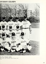
A couple years ago when the baseball team started wearing the script State, but you couldn't buy anything with it on it, I was doing research and found this picture. I noticed two different types of "State" on the jerseys, and they apparently wore then mismatched like this for several years.
I actually prefer the one with the non-script S.
No matter your font preference, we need to stick with "State" as our primary logo theme. We are "State" to our our fans, and nobody else in the southeast goes by "state". To me, the banner M will always be associated with LT, and it has always felt little brother-ish.

It's also the most "Mississippi state fan thing to do" to associate a sticker on a helmet to success on the field..The most Mississippi state fan ever to "hate" the official logo on the university that is literally on every square Inch of campus. Y'all can't have a thing.
We didn't win because of the sticker. But fact remains it was on the helmet when Dan and Dak were here.It's also the most "Mississippi state fan thing to do" to associate a sticker on a helmet to success on the field..
Why it is important to mention that, is because of dumb comments calling the banner M, "LTish". Greg Byrne was AD when we branded under the Banner M and made it THE University logo.
It is beautiful on the baseball uniforms. You done bumped yo head.NO....just don't like the State cursive script....looks FUBU to me....especially hate it on our baseball uniforms
The fact that there are two different versions of the script state on the uniforms in this picture seems very on brand for us. I personally love it.A couple years ago when the baseball team started wearing the script State, but you couldn't buy anything with it on it, I was doing research and found this picture. I noticed two different types of "State" on the jerseys, and they apparently wore then mismatched like this for several years.
I actually prefer the one with the non-script S.
No matter your font preference, we need to stick with "State" as our primary logo theme. We are "State" to our our fans, and nobody else in the southeast goes by "state". To me, the banner M will always be associated with LT, and it has always felt little brother-ish.
View attachment 332528
I don't see any logical reason NOT to be like Oregon, at least in football. Unless you're just trying to mimic a blue blood, which is not a smart idea.Appreciate the concept and artistrty. I just wish MSU could commit to a core design and not be the SEC version of the Oregon Ducks.
By the way, we have a core design. https://www.brand.msstate.edu/assets/index.php#msulogos. Doesn't mean they have to be on the helmet.
This is the way I feel. Whenever anyone else in the SEC talks about us they refer to us as state. LSU is LSU. We need to lean into being state hard.A couple years ago when the baseball team started wearing the script State, but you couldn't buy anything with it on it, I was doing research and found this picture. I noticed two different types of "State" on the jerseys, and they apparently wore then mismatched like this for several years.
I actually prefer the one with the non-script S.
No matter your font preference, we need to stick with "State" as our primary logo theme. We are "State" to our our fans, and nobody else in the southeast goes by "state". To me, the banner M will always be associated with LT, and it has always felt little brother-ish.
View attachment 332528
Just to play devils advocate, the banner, M actually started under LT. It was too complicated because of the wavy banner to put on merchandise, so it was simplified under Byrne. And honestly who gives a fly and flip who it started under? The fact that we have a debate every month or so and a huge portion of people want to get rid of it should say something. If our own Fanbase doesn’t like it then who the hell are we trying to market our program to? I just bought a hat with the flying M symbol on it, because I just simply can’t find a hat with the banner M that looks even halfway decent.We didn't win because of the sticker. But fact remains it was on the helmet when Dan and Dak were here.
Why it is important to mention that, is because of dumb comments calling the banner M, "LTish". Greg Byrne was AD when we branded under the Banner M and made it THE University logo.
Agree with this, and to add people need to get over their fragile self-esteem and start staying, "Hail State" as well. If you don't think it sounds good, well you are the problem (not you HailStout in this instance, more our whole fanbase). If Tanner Allen wasn't scared to say it repeatedly with a national title trophy in his hand, we shouldn't either. The discussion is really closed on that.This is the way I feel. Whenever anyone else in the SEC talks about us they refer to us as state. LSU is LSU. We need to lean into being state hard.
That said, our official logos can still stay the same. The STATE is already emphasized, with an M behind it.
This. People act like if we put a different symbol on the helmet we have to tear down all the banner states on campus. I actually like the banner state on street signs, stationary, documents, at the end of highlight videos, etc. it’s very clean. But it is not a good sports logo at all. We can keep that symbol and have a different one for football. I’m going to go out on a limb here and say no one on this board is upset that the baseball symbol doesn’t match up with our “official” logo.Agree with this, and to add people need to get over their fragile self-esteem and start staying, "Hail State" as well. If you don't think it sounds good, well you are the problem (not you HailStout in this instance, more our whole fanbase). If Tanner Allen wasn't scared to say it repeatedly with a national title trophy in his hand, we shouldn't either. The discussion is really closed on that.
That said, our official logos can still stay the same. The STATE is already emphasized, with an M behind it.
I love the one on the coach better. The S looks better than the & IMHOA couple years ago when the baseball team started wearing the script State, but you couldn't buy anything with it on it, I was doing research and found this picture. I noticed two different types of "State" on the jerseys, and they apparently wore then mismatched like this for several years.
I actually prefer the one with the non-script S.
No matter your font preference, we need to stick with "State" as our primary logo theme. We are "State" to our our fans, and nobody else in the southeast goes by "state". To me, the banner M will always be associated with LT, and it has always felt little brother-ish.
View attachment 332528
True statement.I’m going to go out on a limb here and say no one on this board is upset that the baseball symbol doesn’t match up with our “official” logo.
And honestly, I don't think the Mississippi State (with the State below it, but one of the core logos) is not too bad on the basketball uniform. But point remains, they can be whatever we want. I say be as weird as we want in football, chrome helmets, whatever. That's something no one in the SEC is doing.
But script State is a good one, and could promote the 'State' brand. If we ever get rid of the script State on the baseball uniforms, someone should be fired.
Last edited:
Outside of cowbells and losing, we don't really have any icon branding.Appreciate the concept and artistrty. I just wish MSU could commit to a core design and not be the SEC version of the Oregon Ducks.
Even during the Mullen/Dak Era, which many consider the most successful in our history, we changed uniforms 4 times (if you count the initial change). And had countless other variations. Nothing about our football uniforms is something that must stay. I'm still partial to the Jackie years, but even then we changed uniforms twice, even changed up the interlocking MSU.Outside of cowbells and losing, we don't really have any icon branding.
Keep MState at midfield and midcourt. Other than that, do whatever. Hell we put hashtags in the endzone.
No, they don't because here is the deal. To maximize brand recognition, you need to go one of two ways. You establish a brand and you stick with it long term or, you change it literally every week and in spectacular fashion. Changing things up every few years within a relatively similar framework is the absolute worst thing you can do and we have been masters of doing just that since logos on helmets became a thing in the early 20th century.Yep. People have a really hard time remembering who Oregon is.
I dont disagree with you. Thats why i say we go full weird. SEC roll call even made a joke about us having a different helmet every week at some point this year. Own it. Do the script state, the flying M, bring back the interlocking msu / msj,have the baseball logo, have that separate m and s we used for a while that looks like a 6th grader designed it, use matte helmets, chrome helmets, whit helmets, maroon helmets, just the banner with state on it and no M, the actual state of Mississippi with the banner state over it, bring the walking bully back for a game, plain maroon helmets with no symbol
