&tate script logo making its way everywhere
- Thread starter onewoof
- Start date
You are using an out of date browser. It may not display this or other websites correctly.
You should upgrade or use an alternative browser.
You should upgrade or use an alternative browser.


I'm not gonna lie. I like it and I like it better than the banner M.
Yawn. Looks good on a softball and cheerleaders uniform. I see the HailState Coleman interviews, the players wear the new sideline apparel and that has MState.
I've also noticed that every website, mailer and inch of campus has the banner MState.... it's good &elmon can't change that.
I've also noticed that every website, mailer and inch of campus has the banner MState.... it's good &elmon can't change that.
Last edited:

I am rooting more and more for the script &tate logo just to watch you melt every time it's mentioned.Yawn. Looks good on a softball and cheerleaders uniform. Very plain and soft. I watched Matt Wyatt's NYC videos and enjoyed them but that hat.... lame. I see the HailState Coleman interviews, the players wear the new sideline apparel and that has MState.
I've also noticed that every website, mailer and inch of campus has the banner MState.... it's good &elmon can't change that.
Banner M is an absolute horrible logo and I look forward to watching it die the death it deserves. Banner M logo is synonymous with the Croom/Russell athletics era. It can't get the 17 outta here fast enough.

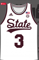
I personally prefer the script &tate. I think its clean and it looks better (to me) on merch. It also allows us to present our nickname, and there are less schools that go by "state" than "bulldogs". Also it is a way for us to move away from a logo. Even our Mississippi State was in a logo format. I realize that not everybody will like it, and nothing we ever roll out will ever accomplish that, but for me I am a fan.
I like white &tate on the maroon jersey, but not the maroon &tate on the white jersey.I personally prefer the script &tate. I think its clean and it looks better (to me) on merch. It also allows us to present our nickname, and there are less schools that go by "state" than "bulldogs". Also it is a way for us to move away from a logo. Even our Mississippi State was in a logo format. I realize that not everybody will like it, and nothing we ever roll out will ever accomplish that, but for me I am a fan.
The MState logo is synonymous with the 1996 Final Four team, Mullen, Dak, Williams, Stans and Schaffer. The most successful eras of MSU football, Women's and Men's basketball.
Also, the MState logo appeared at midfield of Scott field in 1997 and MSU football experienced its most successful 4 years in modern history to that point.
Also, the MState logo appeared at midfield of Scott field in 1997 and MSU football experienced its most successful 4 years in modern history to that point.
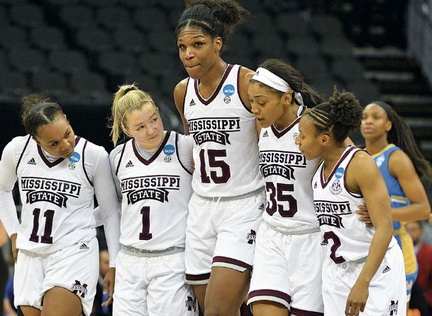
did the basketball team ever wear MState logo? I don't think they did, men or womens. They wore this 3rd option, MISSISSIPPI [BANNER STATE]The MState logo is synonymous with the 1996 Final Four team, Mullen, Dak, Williams, Stans and Schaffer. The most successful eras of MSU football, Women's and Men's basketball.
Also, the MState logo appeared at midfield of Scott field in 1997 and MSU football experienced its most successful 4 years in modern history to that point.
We have &tate now, MState, Mississippi State, M over S... why not add 12 more just to mix it up and keep fans guessing


Can it throw strikes?The MState logo is synonymous with the 1996 Final Four team, Mullen, Dak, Williams, Stans and Schaffer. The most successful eras of MSU football, Women's and Men's basketball.
Also, the MState logo appeared at midfield of Scott field in 1997 and MSU football experienced its most successful 4 years in modern history to that point.
I think the first time the banner M ever appeared anywhere was on the shooting shirt of the mid 90s basketball teams.did the basketball team ever wear MState logo? I don't think they did, men or womens. They wore this 3rd option, MISSISSIPPI [BANNER STATE]
We have &tate now, MState, Mississippi State, M over S... why not add 12 more just to mix it up and keep fans guessing
View attachment 376441
It looks cheap and it’s not good national branding. “State” means nothing outside of Mississippi and that logo isn’t going to help.
Welcome, brother.I'm not gonna lie. I like it and I like it better than the banner M.
It looks cheap and it’s not good national branding. “State” means nothing outside of Mississippi and that logo isn’t going to help.
Well it’s not like the M-State was doing much to help on that front.
Fair enough, whatever they do I’d like to see some consistency and preferably not simply the word “State” in cursive. Like I said before it looks cheap, it doesn’t tell outsiders who we are, and frankly it looks derivative of the Ole Miss script. They are pretty consistent with that branding and I’d like to see our Bulldogs have something completely separate from them at all times.Well it’s not like the M-State was doing much to help on that front.
On the shortsdid the basketball team ever wear MState logo? I don't think they did, men or womens. They wore this 3rd option, MISSISSIPPI [BANNER STATE]

IF.. IF....If Mississippi State has a problem with brand recognition after the Dan/Dak, Womens basketball run and all the CWS runs (in which the MState logo is used on TV)..... the problem isn't the logo.Well it’s not like the M-State was doing much to help on that front.
It's my theory that the whole push to wear all these different throw backs is to introduce a variety of old or dormant logos for consumer consumption. &tate is an old old baseball logo. Pushing &tate is the university just trying to get people to buy a new hat and tshirt every year. It's a smart play in my opinion.
However I get so tired of every time we trot out something, Robbie Faulk and others have to disparage the MState logo. The AD said, it's still the primary logo. So I don't get the point of Faulk taking opportunities to "hate" on MState. Because you can express your like for one and not mention the other. Especially since MState is the primary logo of Mississippi State University.
Men's basketball had a different State script - which I also like.
Thanks HailState Unis.
State Basketball Unis
Looking at that site, I REALLY wish we'd re-incorporate the "Maroons" into some of our branding. I think that's such a cool throwback nickname.
Thanks HailState Unis.
State Basketball Unis
Looking at that site, I REALLY wish we'd re-incorporate the "Maroons" into some of our branding. I think that's such a cool throwback nickname.
Attachments
-
 State Basketball.png251.8 KB · Views: 2
MState and the banner are a boil on the MSU ***. Glad they're going out of athletics. 17ing Templeton ********!
It was my understanding that it first appeared in men's track way, way back when . . . . . . .I think the first time the banner M ever appeared anywhere was on the shooting shirt of the mid 90s basketball teams.
It was my understanding that it first appeared in men's track way, way back whenI think the first time the banner M ever appeared anywhere was on the shooting shirt of the mid 90s basketball teams.
Banner M is an absolute horrible logo and I look forward to watching it die the death it deserves. Banner M logo is synonymous with the Croom/Russell athletics era. It can't get the 17 outta here fast enough.
Another opportunity to bring up the "Flogging a Dead Horse" issue. That banner M-State logo will be around a lot longer than you will I'm guessing.

Another opportunity to bring up the "Flogging a Dead Horse" issue. That banner M-State logo will be around a lot longer than you will I'm guessing.
I like this one. I actually like the script one but you're never gonna get everybody to agree. We don't get to decide anyway, at least I've never seen a poll from the University for us to vote on it.did the basketball team ever wear MState logo? I don't think they did, men or womens. They wore this 3rd option, MISSISSIPPI [BANNER STATE]
We have &tate now, MState, Mississippi State, M over S... why not add 12 more just to mix it up and keep fans guessing
View attachment 376441
Looks like Croom is back. Enjoy the yearBanner M logo is synonymous with the Croom/Russell athletics era. It can't get the 17 outta

I like this script better, mainly because of the stronger S. The other looks like a reverse treble clef, and looks more feminine. But what do I know, I’m just a quarterback.Men's basketball had a different State script - which I also like.
Thanks HailState Unis.
State Basketball Unis
Looking at that site, I REALLY wish we'd re-incorporate the "Maroons" into some of our branding. I think that's such a cool throwback nickname.
FOR IT IS WRITTEN...........SO THAT NO ONE CAN BUY OR SELL UNLE$$ HE HAS THE MARK, THAT IS THE NAME OF THE BEA&T OR THE NUMBER OF IT& NAME. THIS CALL FOR WI$DOM: LET THE ONE WHO HA& THE UNDER&TANDING CALCULATE THE NUMBER OF THE BEA&T, FOR THE MARK I& "&" AND IT& NUMBER IS "17"
AMEN
AMEN
The beast hates the banner M logo as well.FOR IT IS WRITTEN...........SO THAT NO ONE CAN BUY OR SELL UNLE$$ HE HAS THE MARK, THAT IS THE NAME OF THE BEA&T OR THE NUMBER OF IT& NAME. THIS CALL FOR WI$DOM: LET THE ONE WHO HA& THE UNDER&TANDING CALCULATE THE NUMBER OF THE BEA&T, FOR THE MARK I& "&" AND IT& NUMBER IS "17"
AMEN
Hey, does your kid listen to you either? Asking for a friend.The beast hates the banner M logo as well.
I think it's the same as Michigan state's "rebrand".Are we copying Ole Miss and their script helmets?
ALAS P00R &PARTY - I KNEW THEE WELLI think it's the same as Michigan state's "rebrand".
I don't have a problem with the M-State thing as in the middle of the field or even on the side of the pants leg. But I do think the script looks better on the helmets. But as already mentioned.....everyone won't be happy no matter what is done.
THE BEA&T HATE&. PERIOD.The beast hates the banner M logo as well.
That Michigan logo always fools me from a distance. Always see vehicles with a front plate with a big M logo, think it might be ours…always ends up being Michigan.I think it's the same as Michigan state's "rebrand".
And actually I was just asked if I went to Michigan by the girl who cuts my hair. Was wearing a maroon shirt, Bulldog/MState logo on it. Granted she doesn’t know **** about sports or college, but it does show you who has the brand recognition with a similar large block M logo.
Best basketball uniforms were the Final Four ones in 95-96. Second is the 77/78-80/81 ones.Men's basketball had a different State script - which I also like.
Thanks HailState Unis.
State Basketball Unis
Looking at that site, I REALLY wish we'd re-incorporate the "Maroons" into some of our branding. I think that's such a cool throwback nickname.
MState and the banner are going to slowly be gone from athletics. They're going to strictly be educational/university related. Not sure about athletic facility signage changing soon though. That's expensive.