Can someone aware me on why the banner M is so bad? I’m not particularly tied to it, but it is the emblem State has been using in our most successful athletic era. The state script is a bit generic and the interlocking reminds me of a Jackson State emblem.
Banner M
- Thread starter LimaoCabeca
- Start date
You are using an out of date browser. It may not display this or other websites correctly.
You should upgrade or use an alternative browser.
You should upgrade or use an alternative browser.
I think the banner M is generic. When I see pewter plates I can’t tell if it’s us Michigan or Marshall from a distance. That being said, if it means us going back to averaging 7/8 wins a season bring that **** back.Can someone aware me on why the banner M is so bad? I’m not particularly tied to it, but it is the emblem State has been using in our most successful athletic era. The state script is a bit generic and the interlocking reminds me of a Jackson State emblem.
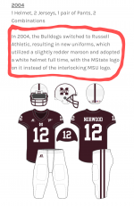
The banner M will forever be associated with Croom for most of us. It was his first year that we started using it for football. Maine, 3-2, 45-0 Ole Miss... All under Croom and his banner M.
It is not. It is the best logo State has ever had.
My theory why script &tate has been shoved upon us...
Unfortunately we have a small fan base and therefore low merch sales numbers. Then you have a young AD comes in that wants to sell more merchandise. So he pushes forward the &tate logo to spike sales of merchandise. I'm sure that helps our payout from adidas.
I bet MState comes back in a few years with a new AD.
More... I think you have two media people that don't like it. They expressed their opinion over and over and over. Their lemmings gobbled up their opinions and run with it on the internet. The banner M hate on Twitter and genes and now On3 are all the same lemmings.
And back to back wins over Alabama.The banner M will forever be associated with Croom for most of us. It was his first year that we started using it for football. Maine, 3-2, 45-0 Ole Miss... All under Croom and his banner M.
Amazing people say this. It first appeared for any sport in 95-96, final four. It was first on the football field and tv shots in 1997. It was present during the greatest era of MState football and basketball.The banner M will forever be associated with Croom for most of us. It was his first year that we started using it for football. Maine, 3-2, 45-0 Ole Miss... All under Croom and his banner M.
We've gotten our *** kicked by bad schools with every logo. I liked the banner personally. Now the MSU was my favorite as it was the one we had when I was a kid so nostalgia and all that. The script state is probably my least favorite of the logos to be honest with you.The banner M will forever be associated with Croom for most of us. It was his first year that we started using it for football. Maine, 3-2, 45-0 Ole Miss... All under Croom and his banner M.
Yet the point remains... Pre Croom football was interlocking MSU. The banner M was a basketball logo. M over S was baseball. The Croom era is when banner M became the primary logo for football and thus the university.Amazing people say this. It first appeared for any sport in 95-96, final four. It was first on the football field and tv shots in 1997. It was present during the greatest era of MState football and basketball.
We weren't buying banner M merch in the 90's. Everything was interlocking MSU and Nike... I never bought anything with a picture of the logo on the 50 at Davis Wade on it to wear around. Croom, Russell, and the Banner M stuff all came together in 2004. It was a package deal and it was gross all the way around. 17ing Russell man, I guess Fruit of the Loom was to spendy. Sadly, Russell was the best of the three of you had to choose between the logo, the coach, or the brand of clothing.

Ole Miss dude wrote that article. Funny he was attempting to make fun of State and State fans ran with it.I hate that the A is off center. I'd be fine with it if it weren't for that.
Ok fine. The current logo was created in 2009 and is an adidas logo. Associated with Mullen, Dak and Vic.Yet the point remains... Pre Croom football was interlocking MSU. The banner M was a basketball logo. M over S was baseball. The Croom era is when banner M became the primary logo for football and thus the university.
We weren't buying banner M merch in the 90's. Everything was interlocking MSU and Nike... I never bought anything with a picture of the logo on the 50 at Davis Wade on it to wear around. Croom, Russell, and the Banner M stuff all came together in 2004. It was a package deal and it was gross all the way around. 17ing Russell man, I guess Fruit of the Loom was to spendy. Sadly, Russell was the best of the three of you had to choose between the logo, the coach, or the brand of clothing.
The Croom, MState and Russel are no longer worn.
Thanks for pointing that out, now I will never unsee it. Of course I had to find out why it is off center. Here is the explanation.I hate that the A is off center. I'd be fine with it if it weren't for that.
Why is the A in the Mississippi State logo off center?
The graphic designer, ultimately, chose to anchor the center to the five letters of 'STATE' rather than to the center letter 'A. '
When have we ever had a logo that wasn't generic? Last one was the flying M back in the late 1960s. MS, MSU, M-State, &tate are all very generic. Which isn't necessarily a bad thing for a logo. Most teams have a generic logo. That said, &tate is the worst of the lot.I think the banner M is generic. When I see pewter plates I can’t tell if it’s us Michigan or Marshall from a distance. That being said, if it means us going back to averaging 7/8 wins a season bring that **** back.
This is correct. The new banner is blockier and looks much better. The Croom stuff has long been gone.Ok fine. The current logo was created in 2009 and is an adidas logo. Associated with Mullen, Dak and Vic.
The Croom, MState and Russel are no longer worn.
Baseball is the only sport that deserves its own logos. Both the M over S and the &tate belong there. And you can put it on merch, that's fine too.
But moving from M-State to &tate as the official athletics logo is a mistake, for a number of reasons. I don't even dislike the idea of another main athletic logo, many SEC schools have this, but &tate just isn't it. It doesn't look good in football, basketball, on the football field, on the basketball court, and it won't look good lit up hanging outside the stadium either.
I am not sure who started this &tate script push, so I won't blame anyone. But we could have sold a ton of merch with that logo, without making it a main logo. Same as if we sell merch with M over S. So I just don't get this - at all. Some folks want to emphasize 'State', well shlt son, we already have. The banner says M-"STATE", dubmasses. And we've started the greeting tradition of 'Hail State', which many of our fans won't embrace. And now with &tate, we are as irrelevant as ever, after a long period of success with a recognizable emblem, that is also our official university emblem.
For a guy who has loved MSU his whole life, it's extremely frustrating to sit here and watch us do these things over and over and over. We've been changing logos our entire history, with little success, until M-State. Now we change that. I'll never fully understand the mindset many of our fans have. We really don't know what's best for us, and most people just don't question anything, fully content to stay exactly where they are.
If you did an out of state poll and asked fans across the nation what the M stood for in the banner, they wouldn't know what the hell you were talking about. It's also bland, generic as others have said, its just lazy. I like it only slightly better than the interlocking because interlocking looks like it was created with 60's fontsCan someone aware me on why the banner M is so bad? I’m not particularly tied to it, but it is the emblem State has been using in our most successful athletic era. The state script is a bit generic and the interlocking reminds me of a Jackson State emblem.
That wasn't Alabama. That was a couple of really bad football teams wearing an Alabama uniform.And back to back wins over Alabama.
Well, you're both right. Yeah it showed up earlier in other ways. But it didn't appear on a football helmet until Croom's first year.Amazing people say this. It first appeared for any sport in 95-96, final four. It was first on the football field and tv shots in 1997. It was present during the greatest era of MState football and basketball.
Still counts. And one of them was coached by the great and almost holy Saban. You could argue Saban studied the great Croom during that game, applied the lessons doled out, and then went on to greatness. Basically, MSU built that program in Tuscaloosa.That wasn't Alabama. That was a couple of really bad football teams wearing an Alabama uniform.
Croom was always a Bammer shill anyway, so you could say he did his part to resurrect the program. Hell you could almost say he was directly responsible after beating Shula.Still counts. And one of them was coached by the great and almost holy Saban. You could argue Saban studied the great Croom during that game, applied the lessons doled out, and then went on to greatness. Basically, MSU built that program in Tuscaloosa.
It boggles my mind that croom was the only state coach to beat SabanCroom was always a Bammer shill anyway, so you could say he did his part to resurrect the program. Hell you could almost say he was directly responsible after beating Shula.
It personally doesn't count to me. Not emotionally, anyway. In 1980? Yeah that counted. It was a big deal...they were number one in the country. In 1996? Yeah, it counted. They were ranked high, we beat them for the first time in 16 years, and we stormed the field.Still counts. And one of them was coached by the great and almost holy Saban. You could argue Saban studied the great Croom during that game, applied the lessons doled out, and then went on to greatness. Basically, MSU built that program in Tuscaloosa.
Those two wins over Bama during the Croom error don't come close to any of that. Shula's last year and Saban's first. That team lost to Louisiana Monroe too, just to refresh your memory.
Damn son, choose joyIt personally doesn't count to me. Not emotionally, anyway. In 1980? Yeah that counted. It was a big deal...they were number one in the country. In 1996? Yeah, it counted. They were ranked high, we beat them for the first time in 16 years, and we stormed the field.
Those two wins over Bama during the Croom error don't come close to any of that. Shula's last year and Saban's first. That team lost to Louisiana Monroe too, just to refresh your memory.
Seems like if they centered the A, that the ends would be off then after scooting to the right.Banner M State is my favorite logo and I wish they would keep it. If they decided to center the "A" that would be great also...
It's like asking why nobody likes your wife's saggy tits.Can someone aware me on why the banner M is so bad? I’m not particularly tied to it, but it is the emblem State has been using in our most successful athletic era. The state script is a bit generic and the interlocking reminds me of a Jackson State emblem.
Answer: Because nobody likes saggy tits!
Last edited:
LOLIt is not. It is the best logo State has ever had.
My theory why script &tate has been shoved upon us...
Unfortunately we have a small fan base and therefore low merch sales numbers. Then you have a young AD comes in that wants to sell more merchandise. So he pushes forward the &tate logo to spike sales of merchandise. I'm sure that helps our payout from adidas.
I bet MState comes back in a few years with a new AD.
More... I think you have two media people that don't like it. They expressed their opinion over and over and over. Their lemmings gobbled up their opinions and run with it on the internet. The banner M hate on Twitter and genes and now On3 are all the same lemmings.
Can someone aware me on why the banner M is so bad? I’m not particularly tied to it, but it is the emblem State has been using in our most successful athletic era. The state script is a bit generic and the interlocking reminds me of a Jackson State emblem.

@Maroon Eagle
It is not. It is the best logo State has ever had.
Why do you hate MSU?************
Can someone aware me on why the banner M is so bad? I’m not particularly tied to it, but it is the emblem State has been using in our most successful athletic era. The state script is a bit generic and the interlocking reminds me of a Jackson State emblem.
Hot take—
We should go back to the emblems used when Wade Walker was AD in the late 50s and 60s.
I’d say that was the most successful era (‘21 CWS champs excepted of course) in MSU history.
And if we didn’t have an emblem, we can just go without.
Back at ya @Mr. Cook
Goat is pro Banner M. My team wins.This is correct. The new banner is blockier and looks much better. The Croom stuff has long been gone.
Baseball is the only sport that deserves its own logos. Both the M over S and the &tate belong there. And you can put it on merch, that's fine too.
But moving from M-State to &tate as the official athletics logo is a mistake, for a number of reasons. I don't even dislike the idea of another main athletic logo, many SEC schools have this, but &tate just isn't it. It doesn't look good in football, basketball, on the football field, on the basketball court, and it won't look good lit up hanging outside the stadium either.
I am not sure who started this &tate script push, so I won't blame anyone. But we could have sold a ton of merch with that logo, without making it a main logo. Same as if we sell merch with M over S. So I just don't get this - at all. Some folks want to emphasize 'State', well shlt son, we already have. The banner says M-"STATE", dubmasses. And we've started the greeting tradition of 'Hail State', which many of our fans won't embrace. And now with &tate, we are as irrelevant as ever, after a long period of success with a recognizable emblem, that is also our official university emblem.
For a guy who has loved MSU his whole life, it's extremely frustrating to sit here and watch us do these things over and over and over. We've been changing logos our entire history, with little success, until M-State. Now we change that. I'll never fully understand the mindset many of our fans have. We really don't know what's best for us, and most people just don't question anything, fully content to stay exactly where they are.
All the more reason to send it to the scrap heapSeems like if they centered the A, that the ends would be off then after scooting to the right.
Your side has definitely won. That's why we continue to be mired in mediocrity. We learned nothing from our success over the 2010s. Have at it, cool guys.Goat is pro Banner M. My team wins.
I’d say that was the ONLY success was the ‘21 CWS champs in MSU history.
Fixed that for ya.
Hot take: Will rogers played better wearing the m banner than the script state
that should crank this up to 11
that should crank this up to 11
Get unlimited access today.


