From the premium board - Logos
- Thread starter dawgstudent
- Start date
You are using an out of date browser. It may not display this or other websites correctly.
You should upgrade or use an alternative browser.
You should upgrade or use an alternative browser.


No to the outlined script logo on uniforms. It’s too fussy. Simple is better.
7 different logos huh... I don't think that's really how you build a brand, but 17it.. Who are we kidding. We'll never be a household brand anyway.
Agreed. No key.No to the outlined script logo on uniforms. It’s too fussy. Simple is better.
This may be akin to the “bevel or no bevel” argument aTm fans.
It may have been mediocre, but we by gosh had a recognizable brand for 20 years before Selmon 17ed it up. And honestly, most university logo brands are pretty mediocre.7 different logos huh... I don't think that's really how you build a brand, but 17it.. Who are we kidding. We'll never be a household brand anyway.
Well the jersey logo for football should be the block "MISS. STATE" and the jersey logo for basketball should be the stacked Mississippi State instead of the arched STATE logo. That thing is goofy as heck.

I don't care as much anymore (mainly because of stuff like this), but yeah, this crap just makes you sick. Our mouthbreathing sector of the fanbase think we're doing something new and getting rid of a bad logo, but in truth, we are being lil ole moo and doing EXACTLY what we've done our whole history, which is continually change shlt like a dog trying to catch its tail. It's maddening. Branding matters, and we can literally do whatever we want with all these uniform logos (with the exception of baseball MS hats), but we REALLY 17ed up by tossing the block-banner M-State. Was a great chance to identify the school, athletics, and 'STATE' all in one, and like others mention, it was 20-years in the making during our most successful athletic run ever. Oh well.7 different logos huh... I don't think that's really how you build a brand, but 17it.. Who are we kidding. We'll never be a household brand anyway.
Not just him, our 'leadership', who unfortunately has begun thinking like many of our fans, pushed this. Cohen was the only thing standing in the way of it - now, with Selmon - well, you see what we've gotten. He does whatever the leadership says.It may have been mediocre, but we by gosh had a recognizable brand for 20 years before Selmon 17ed it up. And honestly, most university logo brands are pretty mediocre.
I challenge you all to look around the identify the people who truly care about MSU, and the folks who just use it for their benefit because it's just what they are. It's a deep-rooted Mississippi issue.
That's my one post about this stupidity.
Remember:7 different logos huh... I don't think that's really how you build a brand, but 17it.. Who are we kidding. We'll never be a household brand anyway.
Interlocking MSU = Football
M over S = Baseball
Banner M State Logo = Basketball & Softball
Godfather knows that nothing buys big screen TV’s like bringing up state’s logo
We're not Miss anything. Leave that to our friends in Oxford and Hattiesburg. We're MISSISSIPPI State.Well the jersey logo for football should be the block "MISS. STATE" and the jersey logo for basketball should be the stacked Mississippi State instead of the arched STATE logo. That thing is goofy as heck.
&tate is a great logo..... for football teams that get pedicures .
Nike's skinny msu is the Ugliest MSU logo used. Use the 1980s MSU before that. Or 86 MSU.
Here's an idea, someone be 17n creative and come up with a good looking logo that isn't something from the past. &tate is from 1970. Skinny MSU is ...again...1996.
Baseballs MS logo is great.
Nike's skinny msu is the Ugliest MSU logo used. Use the 1980s MSU before that. Or 86 MSU.
Here's an idea, someone be 17n creative and come up with a good looking logo that isn't something from the past. &tate is from 1970. Skinny MSU is ...again...1996.
Baseballs MS logo is great.
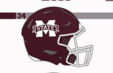
Curved Block letter STATE on the football helmets with walking Bully below***

Like so. **
Yeah that's the ticket!
interlocking MSU on the helmet is my preference BUT if you do &tate script as the main, it has to be the main on football as well due to the # of eyeballs. On the field, on the jerseys, on the stadium. Its not that hard, do what Bama does, consistency instead of all these drastic jarring crazy arse font differences


That "A" is seen millions of times a month and is on millions of pieces of merch. Make it simple and stop being so crazy with these variations.
Right now we have 3 logos, 1 new &tate and 2 old ones. At some point after impressions of the &tate go up and up, you have to just go to this and be done with the old logos. I fully expect some older fans to cry nonstop about this daily for 30 years, more than the Rebs do about Colonel Reb being permanetly retired:
When I read this, I thought you wanted us to go back to crimson maroon colors.Its not that hard, do what Bama does,

Make it simple and stop being so crazy with these variations.
Now this I agree with.
Bama has the A on the field a stencil number on their helmet.interlocking MSU on the helmet is my preference BUT if you do &tate script as the main, it has to be the main on football as well due to the # of eyeballs. On the field, on the jerseys, on the stadium. Its not that hard, do what Bama does, consistency instead of all these drastic jarring crazy arse font differences
View attachment 608139 View attachment 608140
That "A" is seen millions of times a month and is on millions of pieces of merch. Make it simple and stop being so crazy with these variations.
Right now we have 3 logos, 1 new &tate and 2 old ones. At some point after impressions of the &tate go up and up, you have to just go to this and be done with the old logos. I fully expect some older fans to cry nonstop about this daily for 30 years, more than the Rebs do about Colonel Reb being permanetly retired:
View attachment 608148Hit
We had a permanent logo and then some dbags that ruled jeans page (now the premium here) .... and Brian Hadad bitched none stop about our permanent logo.
Clef! tate!
90% of the fans at games this fall will have the M Banner State logo because, like Me, they have a closet full of gray, white, maroon and black shirts and ain't paying $80 a piece for 5 new shirts and $120 for a pullover just because someone said this is our new brand.
We po and proud of it!
We po and proud of it!
It's asinine to make fun of someone who is in your side because their State gear didn't cost a week's paycheck and their bumper sticker is on a Mercedes Benz or a Rolls Royce!
You're right. After looking at onewoof's post above it's a dang treble clef.Bama has the A on the field a stencil number on their helmet.
We had a permanent logo and then some dbags that ruled jeans page (now the premium here) .... and Brian Hadad bitched none stop about our permanent logo.
Clef! tate!
It looks like a diagram of how to tie a hook to a fishing lineYou're right. After looking at onewoof's post above it's a dang treble clef.
I wonder if other fanbases constantly obsess over a logo like ours does. It’s quite the phenomenon
Most schools don't completely change their logo every 20 years.I wonder if other fanbases constantly obsess over a logo like ours does. It’s quite the phenomenon
Where are the mole crickets?@7Dust posted this. Ain't nothing like a summertime logo discussion. What do you think?


I prefer the M over S. The script State just is a little too feminine looking for me. Looks out of place on the helmet. Plus the M over S reminds me of our only glory days as state fans. That reason alone is why it should be our only logo. That “baseball only” argument just doesn’t make any sense to me and I love some baseball.
Pretty much everyone outside of the southeast doesn’t know the difference between us and OM. So I’ll have to strongly disagree here.It may have been mediocre, but we by gosh had a recognizable brand for 20 years before Selmon 17ed it up. And honestly, most university logo brands are pretty mediocre.

That has nothing to do with a logo. It has to do with losing and being a small population state with a tiny fan base.Pretty much everyone outside of the southeast doesn’t know the difference between us and OM. So I’ll have to strongly disagree here.
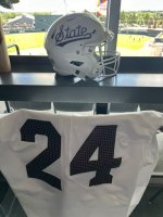
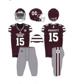
2015. Best uniforms we’ve worn over all. Maybe possibly change the chest logo to STATE. Also like the idea of the M over S as the helmet logo as well. These pants should be the most worn home and and away.
Attachments
-
 IMG_0265.jpeg100.1 KB · Views: 4
 -
 IMG_0264.jpeg43.9 KB · Views: 4
 -
 IMG_0266.jpeg23.4 KB · Views: 4
You could put the Atlanta Braves "A" logo, the Alabama one and the Arkansas one side by side in black and white and ask people to identify which is which and I bet a huge majority wouldn't get them rightinterlocking MSU on the helmet is my preference BUT if you do &tate script as the main, it has to be the main on football as well due to the # of eyeballs. On the field, on the jerseys, on the stadium. Its not that hard, do what Bama does, consistency instead of all these drastic jarring crazy arse font differences
View attachment 608139 View attachment 608140
That "A" is seen millions of times a month and is on millions of pieces of merch. Make it simple and stop being so crazy with these variations.
Right now we have 3 logos, 1 new &tate and 2 old ones. At some point after impressions of the &tate go up and up, you have to just go to this and be done with the old logos. I fully expect some older fans to cry nonstop about this daily for 30 years, more than the Rebs do about Colonel Reb being permanetly retired:
View attachment 608148
Our fans wouldn't "obsess" over them if the powers that be would just pick ONE and run with it. But since that seems to not be a possibility then it is what it is. I blame it on 17'in Adidas because they want to pump out more Euro looking 3 stripe soccer looking crap every year with different logosI wonder if other fanbases constantly obsess over a logo like ours does. It’s quite the phenomenon
I like the script on the helmets and on the field. All of the basketball jerseys this season will have the script on them. I think it’s a sharp logo. Many hated the banner M because of Croom. I’d bet that many hate the script because of the first football team that wore it and their performance.