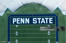
FC/OT: Updated end zone graphics for OSU…
- Thread starter Midnighter
- Start date
You are using an out of date browser. It may not display this or other websites correctly.
You should upgrade or use an alternative browser.
You should upgrade or use an alternative browser.
Nooooooooooooooooo!!!!!!!!!!!!!
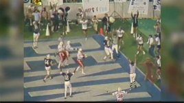
Heck, paint it just like 1982 Nebraska. Block letters rule our end zones!
Heck, paint it just like 1982 Nebraska. Block letters rule our end zones!
Hoping the Blue Band does a script Pennsylvania (with a piccalo player doting the i)
Looking like a move to a script font (and have been seeing a lot of gear with this as well)…

Like this jacket
Those jackets were part of a gear box sent to Nittany Lion NFL players this year. Not available to the general public as far as I know.
Also this vest has a script logo
View attachment 681508
I think it’s gonna look great. Would love to see our cheerleaders wear it too.
No school hates their logo more than Penn State. Nothing at midfield, nothing in the endzones. Might as well put diagonal slash lines in the endzone like they do at one end of Heinz.
Illinois

That script font would look more at home on a high school varsity baseball jacket. Or I could see it on a cheerleader's uniform. It seems quite out of character for a football field.
I don't understand what was wrong with the old "worm" font that went with the "chipmunk" lion logo. It was distinctive and looked great on anything. But, of course, it was introduced during the 1980s when Penn State won two national championships under that coach whose name shall forever be forgotten. We wouldn't want to keep anything around from that era, would we? I suspect the "chipmunk" logo will be the next to be consigned to the round file.
I don't understand what was wrong with the old "worm" font that went with the "chipmunk" lion logo. It was distinctive and looked great on anything. But, of course, it was introduced during the 1980s when Penn State won two national championships under that coach whose name shall forever be forgotten. We wouldn't want to keep anything around from that era, would we? I suspect the "chipmunk" logo will be the next to be consigned to the round file.
Home team gimmicks are rarely successful. Just play football. 
I’m getting a bad vibe about this game.
Between Larry Johnson’s demonstrated history as a dirty DL coach and his bizarre unwillingness to retire, I’ll be surprised if Pribula survives the first half.
I’m getting a bad vibe about this game.
Between Larry Johnson’s demonstrated history as a dirty DL coach and his bizarre unwillingness to retire, I’ll be surprised if Pribula survives the first half.
A friend of mine said PSU is wearing white Sat. And OSU is wearing red
I don't believe it.
Will T
Brilliant, the Buckeye players will be confused because they will see the script and be trying to figure out where the I is.
Brilliant, the Buckeye players will be confused because they will see the script and be trying to figure out where the I is.
You assume they know that there’s an ‘i’ in ohio.
Latest posts
Get unlimited access today.


