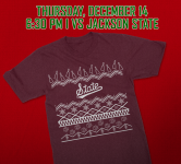
The big Mstate outside the stadium might be replaced...
- Thread starter dawgstudent
- Start date
You are using an out of date browser. It may not display this or other websites correctly.
You should upgrade or use an alternative browser.
You should upgrade or use an alternative browser.
If they do that then I think it is safe to say they are all in with &tate. And thank god they are leaning into us being State. I have been screaming this for years.
also, this thread should go well
also, this thread should go well
Here waiting for the first person to call it the Big MStake… **

Oh wait… that’s me… **


Oh wait… that’s me… **

Script State on the way
I’m here for the comments.

I’m here for the comments.

I mean, the reaction to the return of the interlocking MSU was universal praise, so of course, we're going in a different direction.


If you rearrange the letters in that guys Twitter handle it spells JackatShelter.
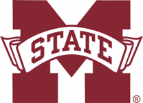
Goodbye boring, corporate Banner M
Goodbye boring, corporate Banner M
Ridiculous. There's literally no one that can say that the MState on the stadium doesn't look awesome at night.
when it's serviced and lights up properly it looks great. Big waste of money to take it down and trash it.Ridiculous. There's literally no one that can say that the MState on the stadium doesn't look awesome at night.
I'm really just curious how a big logo that says 'STATE' across the middle of it, is NOT leaning into being State?If they do that then I think it is safe to say they are all in with &tate. And thank god they are leaning into us being State. I have been screaming this for years.
also, this thread should go well
You and whomever else....If they do that then I think it is safe to say they are all in with &tate. And thank god they are leaning into us being State. I have been screaming this for years.
Please explain why and how the logo "&tate" or just the word State, is a good idea to brand and distinguish Mississippi State University.
I really hope there’s a plan to hang this on a 100 ft pole off of Hwy 6 in Oxford
just State. Not M-state or MSU. For the record I think the big banner M on the side of the stadium looks great and I doubt the &tatr logo will look as good. I still think the banner M looks like **** on helmetsYou and whomever else....
Please explain why and how the logo "&tate" or just the word State, is a good idea to brand and distinguish Mississippi State University.
Not a big fan of the interlocking MSU either, but it would be 100 times better than $tate. Personally, I'd either go back to M-State (not gonna happen), or create a completely new logo (maybe one that doesn't even suck if we can).I mean, the reaction to the return of the interlocking MSU was universal praise, so of course, we're going in a different direction.

Montana State is in the market, have no fear.****when it's serviced and lights up properly it looks great. Big waste of money to take it down and trash it.
On a serious note, wonder who they plan to sell it to and how heavy it is? Would look great on the side of a 120k bushel grain bin.
The banner M's issue isn't that it doesn't promote "STATE". The issue is that its a tired logo that fans are done with. I'm not the biggest proponent of the script &tate, but it's an improvement on the banner. I wish the script was a secondary logo personally, but the banner M has overstayed it's welcome.I'm really just curious how a big logo that says 'STATE' across the middle of it, is NOT leaning into being State?
I'm sure this request is a futile attempt but.... And thank god they are leaning into us being State. I have been screaming this for years.
Explain why you have been screaming and why this is good marketing, branding etc for Mississippi State University?
I'm not a fan of it either, it looks exactly like what it is, old and tired from the 90's.Not a big fan of the interlocking MSU either, but it would be 100 times better than $tate. Personally, I'd either go back to M-State (not gonna happen), or create a completely new logo (maybe one that doesn't even suck if we can).
That said there is a lot of it out there right now though. I had to go to several local Starkville outlets this weekend for gifts and I saw it in quantities everywhere. It's either left overs from the big push for it during the 25th recognition or the outlets have ordered heavily for Christmas
Maybe they will auction it off to raise NIL $$. It would also look awesome at the SPS tailgate tent.On a serious note, wonder who they plan to sell it to and how heavy it is? Would look great on the side of a 120k bushel grain bin.
My years of marketing research.I'm sure this request is a futile attempt but...
Explain why you have been screaming and why this is good marketing, branding etc for Mississippi State University?
In reality, it’s just because the entire SEC refers to us as state the same way LSU is LSU. Own it. just be state. Try to make it who we are nationally. I have zero marketing knowledge and this may be the greatest mistake in the history of anything that has ever happened on earth. It is what I refer to as my opinion. Rare to see one of those on this board i know.
I hope you don’t feel your attempt was futile.
A lot of us on the board relate a little too well to that descriptionit looks exactly like what it is, old and tired from the 90's.
Last edited:
Banner is the official logo of the university and that is not changing. This is all about athletic stuff. Some of those logos can vary (like baseball, with abundant tradition), but when in doubt, why do it? Especially with a crappier logo that no one wants?The banner M's issue isn't that it doesn't promote "STATE". The issue is that its a tired logo that fans are done with. I'm not the biggest proponent of the script &tate, but it's an improvement on the banner. I wish the script was a secondary logo personally, but the banner M has overstayed it's welcome.
It should just be the block STATE we use in the Dr Pepper commercials.***
Would love to see the M over S in its place. That crap about it being baseball only has got to be the most insane argument ever. It’s the logo we won our only natty with. Slap that ***** everywhere. That script state just looks sissyfied and way to close to UMs script on their helmets.
I don't like the banner logo but the sign looked great on the stadium. Hoping the the interlocking logo instead of the script if they replace it
My years of marketing research.
In reality, it’s just because the entire SEC refers to us as state the same way LSU is LSU. Own it. just be state.
There’s like 49 other “State” teams in the US.
Dr Pepper marketing refers to generic “State” in almost every Fansville TV commercial.
Polk won't allow it to be used for any sport other than baseball and he ain't even on the payroll to my knowledge.Would love to see the M over S in its place. That crap about it being baseball only has got to be the most insane argument ever. It’s the logo we won our only natty with. Slap that ***** everywhere. That script state just looks sissyfied and way to close to UMs script on their helmets.
I kind of love that T-shirt
But there is only one “state” in the SEC. And the SEC is the biggest dog in the yard.There’s like 49 other “State” teams in the US.
Dr Pepper marketing refers to generic “State” in almost every Fansville TV commercial.
I kind of love that T-shirt
In an "Ugly Christmas T-Shirt" kind of way?
Devils advocate. I can’t keep New Mexico and New Mexico State straight. If the latter went by just State I think I could.There’s like 49 other “State” teams in the US.
Dr Pepper marketing refers to generic “State” in almost every Fansville TV commercial.
But at the end of the day I think people either know us or don’t. OM has made it more complicated with their bevy of names. I think very few ever thought the banner was a good logo. Pretty much any logo decision LT made was bad.
