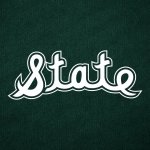
Yeah that script State is so unique and original. It could only be MSU.


Devils advocate. I can’t keep New Mexico and New Mexico State straight. If the latter went by just State I think I could.
But at the end of the day I think people either know us or don’t. OM has made it more complicated with their bevy of names. I think very few ever thought the banner was a good logo. Pretty much any logo decision LT made was bad.
Not bad or just a big picture of Bert Stare. He's been so good at forecasting our head coaching hires let's honor him.
Well I'll stop you right there. Ridiculous to say that no one wants the script &tate. It has more support from the fanbase than the banner M without any question.Banner is the official logo of the university and that is not changing. This is all about athletic stuff. Some of those logos can vary (like baseball, with abundant tradition), but when in doubt, why do it? Especially with a crappier logo that no one wants?
Ironically enough, that helmet is a one-off throwback for Michigan State, who has in the last couple of decades staked their claim in branding as "MSU". So MSU is not exactly original or unique.Yeah that script State is so unique and original. It could only be MSU.
View attachment 477215
View attachment 477216
The decision on the current branding and logos was made after Larry Templeton retired.Pretty much any logo decision LT made was bad.
I think you're wrong on that. And you conveniently ignored the first 75% of my post.Well I'll stop you right there. Ridiculous to say that no one wants the script &tate. It has more support from the fanbase than the banner M without any question.
Yeah but the Banner M started with LT. Thats the only reason it even made that cut.The decision on the current branding and logos was made after Larry Templeton retired.
The current logos were put into place by Greg Byrne after consulting with a national marketing firm.
Almost. The old banner M-State was on the football field and basketball court back in the late 90s. But yes, Byrne is the one who spearheaded the overall change to it, in everything. A lot of time, effort and money was put into that, and it represents the most successful athletic era of our history. That emblem is the most recognizable we've EVER had, without question.The decision on the current branding and logos was made after Larry Templeton retired.
The current logos were put into place by Greg Byrne after consulting with a national marketing firm.
 tate. The script seems and looks feminine. STATE looks stronger and masculine.
Just wait until Dr Pepper has a commercial where they show a cursive State… **There’s like 49 other “State” teams in the US.
Dr Pepper marketing refers to generic “State” in almost every Fansville TV commercial.
Byrne had every opportunity to throw it in the trash and come up with a totally new logo. He did not. The marketing firm did not.Yeah but the Banner M started with LT. Thats the only reason it even made that cut.
yeah that was kinda the point of my wording.Ironically enough, that helmet is a one-off throwback for Michigan State, who has in the last couple of decades staked their claim in branding as "MSU". So MSU is not exactly original or unique.
MSJ was an emblem of our success during the 90s, and the MState was an emblem of our success in the 2010s. I guess &tate will get its due in the 2030s when we finally have success again, based on our history.I think any logo, MS, MSU (1980s) and MState are better than just a &tate logo. Because of branding.
Everyone already knows us as "State" in the SEC and regionally. You gain nothing with a "State" only logo. When Mississippi State University markets, they are marketing to those that don't know us, nationally.
The MState logo incorporates what any logo needs and most other schools use currently. A power logo, the M is a power logo. The banner State incorporates our nickname and what should endear most fans.
If I was AD for the day, if so many are truly unhappy with the "Banner M". I would go with the Flying M, M, less the arrow. Then incorporate a block font State across the M. (Yes similar to the Banner M, banner removed and different font M).
OR go to the 1980s MSU (MSJ). However tweak it to look more MSU. The nike MSU is to skinny of a font for me.
Or the baseball, MS. However tweak it to look more North Carolina's NC on their helmet. Bigger, bolder with a curvature to give it personality.
Devils advocate. I can’t keep New Mexico and New Mexico State straight. If the latter went by just State I think I could.
True story. In the mid 2000s, when we made the switch to Russell for all sports, the deal included the banner M-State for everything (note Croom helmets and uniforms). As part of the deal, Templeton told Polk that the baseball hats would have the banner M-State. Polk said "hell no they won't." Templeton responded "well, Russell is paying us $500k just for baseball, so if you can come up with that money yourself, then you can keep the M-over-S." Polk made 10 phone calls, raised the $500k for baseball, and (thankfully) kept the baseball hats. That's how we ended up with god-awful baseball uniforms (check the banner on the sleeve below) but kept the M-over-S.Almost. The old banner M-State was on the football field and basketball court back in the late 90s. But yes, Byrne is the one who spearheaded the overall change to it, in everything. A lot of time, effort and money was put into that, and it represents the most successful athletic era of our history. That emblem is the most recognizable we've EVER had, without question.
And now, we have people that want to throw it away, and start over (LIKE WE HAVE ALWAYS DONE IN OUR HISTORY EXCEPT BASEBALL - shocking that baseball is the pride of our university, right?). We don't learn. What we've always done doesn't work.

We're not competing against most of those (and there's many more 49).There’s like 49 other “State” teams in the US.
Indeed. Interesting story, that's one good thing to come out of Polk 2, because any other coach might would have let that slide.True story. In the mid 2000s, when we made the switch to Russell for all sports, the deal included the banner M-State for everything (note Croom helmets and uniforms). As part of the deal, Templeton told Polk that the baseball hats would have the banner M-State. Polk said "hell no they won't." Templeton responded "well, Russell is paying us $500k just for baseball, so if you can come up with that money yourself, then you can keep the M-over-S." Polk made 10 phone calls, raised the $500k for baseball, and (thankfully) kept the baseball hats. That's how we ended up with god-awful baseball uniforms (check the banner on the sleeve below) but kept the M-over-S.
Thank you, Polk II.
View attachment 477249

Or the front of my average sized 4br/2ba houseOn a serious note, wonder who they plan to sell it to and how heavy it is? Would look great on the side of a 120k bushel grain bin.
I really, REALLY don't understand why we can't just leave the M-State at midfield and on the stadium, and use the MSJ on the helmets. I don't understand why this is so hard. Why the script State? Use it in baseball and on polo shirts, hoodies, whatever. It's a baseball logo.
Everybody wins.
Again - NO REASON TO MAKE &TATE AN OFFICIAL LOGO.
I agree, and I think it is Fugly in the helmetsRidiculous. There's literally no one that can say that the MState on the stadium doesn't look awesome at night.
Whoops. I didn't scroll far enough.Yeah that script State is so unique and original. It could only be MSU.
View attachment 477215
View attachment 477216
I didn't conveniently ignore it. Your question is "why do it?" The answer is because people don't want the banner as the athletic logo and the script &tate is our other option that doesn't muddy the State vs MSU branding.I think you're wrong on that. And you conveniently ignored the first 75% of my post.
He's not even remotely close to wrong. The fans want our damn interlocking MSU, but the school leaders suck, so we settle for Script STATE and block Mississippi State. But are better than the academic M.I think you're wrong on that. And you conveniently ignored the first 75% of my post.
The banner M looks like **** everywhere. Always hasjust State. Not M-state or MSU. For the record I think the big banner M on the side of the stadium looks great and I doubt the &tatr logo will look as good. I still think the banner M looks like **** on helmets
Glad I’m not the only one who doesn’t like the interlocking MSU. To me it looks more like the 80s than the 90s.I'm not a fan of it either, it looks exactly like what it is, old and tired from the 90's.
That said there is a lot of it out there right now though. I had to go to several local Starkville outlets this weekend for gifts and I saw it in quantities everywhere. It's either left overs from the big push for it during the 25th recognition or the outlets have ordered heavily for Christmas
Again, it’s a baseball logo. Football is a more masculine sport…thus, STATE serves way better. Besides, the baseball already has an everyday strong masculine logo that they get to wear on their hats.The State script goes back to at least 1961. Other than just the classic block lettering of "STATE", there is no other MSU logo that goes back that far. Like it or not, it's not just some newfangled design.
View attachment 477256
What fans? The majority of keyboard fans? I honestly would be interested in in a more overall representative fan poll. Not saying you’re wrong, but that I would truly be interested in the results if done fairly. I would guess that you are wrong though.He's not even remotely close to wrong. The fans want our damn interlocking MSU, but the school leaders suck, so we settle for Script STATE and block Mississippi State. But are better than the academic M.
The ones not 60+ and still living in Larry Templeton's world.What fans? The majority of keyboard fans? I honestly would be interested in in a more overall representative fan poll. Not saying you’re wrong, but that I would truly be interested in the results if done fairly. I would guess that you are wrong though.
I still think you’re wrong if a more than a keyboard fan vote or poll is done. Not to mention you have to also include the fan and alumni base that is under 35.The ones not 60+ and still living in Larry Templeton's world.