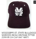
Thus ends one of the biggest lies ever perpetrated on the MSU fanbase

615dawg

Well-known member
Jun 4, 2007
5,439
1,010
113
Some of us have been saying this for years. The "Nike owns the interlocking MSU logo" was a flat out lie from the Larry Templeton administration.

Here's the truth, starting from the beginning.

The "MSJ" logo of the 80s was the first MSU logo that was somewhat recognizable in college football. In the early 90s, the apparel contracts started when Auburn signed a deal with Russell Athletic. Florida went with Starter, and MSU went with a company called Apex. It wasn't long before Nike saw the potential and started signing schools. We were actually in the first batch of schools to sign with Nike. Prior to the 1996 season, Nike "modernized" our uniforms to the look that we all know and love.

Step back a couple of years, and we had the Jeff Malone fiasco - he "donated" a new basketball court and we put his number on the court but he never paid for it. Richard Williams was about to have the team rolling and wanted his own logo because baseball had theirs. On a trip, he had seen the Marshall track team and liked their logo. It was created in house, but the first version of the Banner M-State was born. It was awful. When it was painted on the court, to save money it was freehanded so it was off center and looked terrible (We had this court through 2000, by the way).

Terrible M-State on the Basketball Court

But back to football (and track and field), who had the Nike contracts in the mid-90s. One of Nike's suggestions was a updated MSJ logo. A Nike designer did come up with the updated look, but Nike never owned it. Our athletic department was stuck in the 80s at the time, but they weren't stupid enough to not have rights to the primary logo. The design was exclusive to Nike branded merchandise for seven years, but was ours.

Prior to the 2001-22 season, Adidas came on as a basketball-only sponsor. The basketball SID made a suggestion that Adidas put into the uniforms. Like many schools with two-word names - it was first word above the number and second below. So our uniforms had Mississippi above the number, then State under the number. When you took a headshot of a player, all you saw was Mississippi. He suggested we somehow get Mississippi State above the number.

There was a falling out between Nike and the athletic department in 2003 (the Oregon hydrating uniform story), and it happened to coincide with the end of our seven year deal. It could have been solved, but when Sly Croom came on prior to the 2004 season, he wanted to look like Alabama. Plain jerseys, two stripe pants, etc. Russell Athletic, which was headquartered miles from the Auburn campus, had lost its deal with Auburn as they became one of the first Under Armour schools. RA was desperate and made an offer that our cheap AD could not refuse. While everyone was ditching Russell, we signed a five year deal. By the end of that deal, Mississippi State and Georgia Tech were the only D1 schools aligned with Russell.

Russell's machines could not properly embroider the "Nike MSU" or the Banner M-State. If you have Russell gear in the back of your closet, go look at it - it looks like crap. The banner M-State looked better, and the university licensing department (Yes, we did our own thing at the time) had wanted to go to one logo for years - so the decision was made to go all-in on the banner M-State other than baseball. The Nike exclusivity on the interlocking MSU was over - and you could find a few things for a couple of years, but it was sparse. Midwestern State in Texas and Montana State used the logo on their football helmets for a time as well.
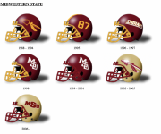
Screen Shot 2023-08-16 at 8.11.53 AM.png

The fan gear from Russell was awful. The uniforms (in all sports) were awful. It was perhaps the worst rebranding in SEC sports history. It was wildly unpopular and it didn't help that it was a terrible time for MSU sports sans men's basketball (who had an Adidas contract). The athletic department used Gene and Gene's Page to circulate the rumor that we HAD to switch because Nike owned the logo and they did us dirty on the Oregon thing. The fact is that Russell offered more money than Nike, then produced ****** stuff.


When we signed on with Adidas in 2009, they recommended an updated logo. By this time we had a competent, non-cheap athletic director who did a proper re-branding (and also led to a great Jack at Shelter thread).
 
Last edited:

GloryDawg

Well-known member
Mar 3, 2005
14,423
5,219
113
I don't know what changed in the mind set but it happened under Selmon, so he gets the credit in "My Book" On the flip side if our baseball team sucks this coming season, he's going to get the credit for that as well for not hiring a new coach.,
 

greenbean.sixpack

Well-known member
Oct 6, 2012
6,063
4,618
113
Did Simpleton (or anyone in the AD) actually tell fans Nike owned MSU, or did we just assume it?
 
Last edited:

Motodawg

Member
Apr 19, 2018
319
224
43
Some of us have been saying this for years. The "Nike owns the interlocking MSU logo" was a flat out lie from the Larry Templeton administration.

Here's the truth, starting from the beginning.

The "MSJ" logo of the 80s was the first MSU logo that was somewhat recognizable in college football. In the early 90s, the apparel contracts started when Auburn signed a deal with Russell Athletic. Florida went with Starter, and MSU went with a company called Apex. It wasn't long before Nike saw the potential and started signing schools. We were actually in the first batch of schools to sign with Nike. Prior to the 1996 season, Nike "modernized" our uniforms to the look that we all know and love.

Step back a couple of years, and we had the Jeff Malone fiasco - he "donated" a new basketball court and we put his number on the court but he never paid for it. Richard Williams was about to have the team rolling and wanted his own logo because baseball had theirs. On a trip, he had seen the Marshall track team and liked their logo. It was created in house, but the first version of the Banner M-State was born. It was awful. When it was painted on the court, to save money it was freehanded so it was off center and looked terrible (We had this court through 2000, by the way).

Terrible M-State on the Basketball Court

But back to football (and track and field), who had the Nike contracts in the mid-90s. One of Nike's suggestions was a updated MSJ logo. A Nike designer did come up with the updated look, but Nike never owned it. Our athletic department was stuck in the 80s at the time, but they weren't stupid enough to not have rights to the primary logo. The design was exclusive to Nike branded merchandise for seven years, but was ours.

Prior to the 2001-22 season, Adidas came on as a basketball-only sponsor. The basketball SID made a suggestion that Adidas put into the uniforms. Like many schools with two-word names - it was first word above the number and second below. So our uniforms had Mississippi above the number, then State under the number. When you took a headshot of a player, all you saw was Mississippi. He suggested we somehow get Mississippi State above the number.

There was a falling out between Nike and the athletic department in 2003 (the Oregon hydrating uniform story), and it happened to coincide with the end of our seven year deal. It could have been solved, but when Sly Croom came on prior to the 2004 season, he wanted to look like Alabama. Plain jerseys, two stripe pants, etc. Russell Athletic, which was headquartered miles from the Auburn campus, had lost its deal with Auburn as they became one of the first Under Armour schools. RA was desperate and made an offer that our cheap AD could not refuse. While everyone was ditching Russell, we signed a five year deal. By the end of that deal, Mississippi State and Georgia Tech were the only D1 schools aligned with Russell.

Russell's machines could not properly embroider the "Nike MSU" or the Banner M-State. If you have Russell gear in the back of your closet, go look at it - it looks like crap. The banner M-State looked better, and the university licensing department (Yes, we did our own thing at the time) had wanted to go to one logo for years - so the decision was made to go all-in on the banner M-State other than baseball. The Nike exclusivity on the interlocking MSU was over - and you could find a few things for a couple of years, but it was sparse. Midwestern State in Texas and Montana State used the logo on their football helmets for a time as well.

View attachment 386015

The fan gear from Russell was awful. The uniforms (in all sports) were awful. It was perhaps the worst rebranding in SEC sports history. It was wildly unpopular and it didn't help that it was a terrible time for MSU sports sans men's basketball (who had an Adidas contract). The athletic department used Gene and Gene's Page to circulate the rumor that we HAD to switch because Nike owned the logo and they did us dirty on the Oregon thing. The fact is that Russell offered more money than Nike, then produced ****** stuff.


When we signed on with Adidas in 2009, they recommended an updated logo. By this time we had a competent, non-cheap athletic director who did a proper re-branding (and also led to a great Jack at Shelter thread).
Link to thread?
 

Clay Lyle

Well-known member
Sep 30, 2022
501
561
93
I also think that Byrne wanted us to stay away from “MSU” to have a distinctly different brand than Michigan State, so his crew continued to push the Nike owns “MSJ” story.
 

horshack.sixpack

Well-known member
Oct 30, 2012
9,059
5,062
113
Some of us have been saying this for years. The "Nike owns the interlocking MSU logo" was a flat out lie from the Larry Templeton administration.

Here's the truth, starting from the beginning.

The "MSJ" logo of the 80s was the first MSU logo that was somewhat recognizable in college football. In the early 90s, the apparel contracts started when Auburn signed a deal with Russell Athletic. Florida went with Starter, and MSU went with a company called Apex. It wasn't long before Nike saw the potential and started signing schools. We were actually in the first batch of schools to sign with Nike. Prior to the 1996 season, Nike "modernized" our uniforms to the look that we all know and love.

Step back a couple of years, and we had the Jeff Malone fiasco - he "donated" a new basketball court and we put his number on the court but he never paid for it. Richard Williams was about to have the team rolling and wanted his own logo because baseball had theirs. On a trip, he had seen the Marshall track team and liked their logo. It was created in house, but the first version of the Banner M-State was born. It was awful. When it was painted on the court, to save money it was freehanded so it was off center and looked terrible (We had this court through 2000, by the way).

Terrible M-State on the Basketball Court

But back to football (and track and field), who had the Nike contracts in the mid-90s. One of Nike's suggestions was a updated MSJ logo. A Nike designer did come up with the updated look, but Nike never owned it. Our athletic department was stuck in the 80s at the time, but they weren't stupid enough to not have rights to the primary logo. The design was exclusive to Nike branded merchandise for seven years, but was ours.

Prior to the 2001-22 season, Adidas came on as a basketball-only sponsor. The basketball SID made a suggestion that Adidas put into the uniforms. Like many schools with two-word names - it was first word above the number and second below. So our uniforms had Mississippi above the number, then State under the number. When you took a headshot of a player, all you saw was Mississippi. He suggested we somehow get Mississippi State above the number.

There was a falling out between Nike and the athletic department in 2003 (the Oregon hydrating uniform story), and it happened to coincide with the end of our seven year deal. It could have been solved, but when Sly Croom came on prior to the 2004 season, he wanted to look like Alabama. Plain jerseys, two stripe pants, etc. Russell Athletic, which was headquartered miles from the Auburn campus, had lost its deal with Auburn as they became one of the first Under Armour schools. RA was desperate and made an offer that our cheap AD could not refuse. While everyone was ditching Russell, we signed a five year deal. By the end of that deal, Mississippi State and Georgia Tech were the only D1 schools aligned with Russell.

Russell's machines could not properly embroider the "Nike MSU" or the Banner M-State. If you have Russell gear in the back of your closet, go look at it - it looks like crap. The banner M-State looked better, and the university licensing department (Yes, we did our own thing at the time) had wanted to go to one logo for years - so the decision was made to go all-in on the banner M-State other than baseball. The Nike exclusivity on the interlocking MSU was over - and you could find a few things for a couple of years, but it was sparse. Midwestern State in Texas and Montana State used the logo on their football helmets for a time as well.

View attachment 386015

The fan gear from Russell was awful. The uniforms (in all sports) were awful. It was perhaps the worst rebranding in SEC sports history. It was wildly unpopular and it didn't help that it was a terrible time for MSU sports sans men's basketball (who had an Adidas contract). The athletic department used Gene and Gene's Page to circulate the rumor that we HAD to switch because Nike owned the logo and they did us dirty on the Oregon thing. The fact is that Russell offered more money than Nike, then produced ****** stuff.


When we signed on with Adidas in 2009, they recommended an updated logo. By this time we had a competent, non-cheap athletic director who did a proper re-branding (and also led to a great Jack at Shelter thread).
Good post. The most interesting thing in this to me is perspective. You are clearly a person who notices and cares about these a fair amount. That being said, your statement about how terrible the original MState logo looked on the floor at the Hump does not resonate with me. As someone who does not have the eye for those kinds of things, I just saw a new logo on the floor. I was in school then, went to every game, and never was offended by that logo on the floor.
 
Last edited:

Motodawg

Member
Apr 19, 2018
319
224
43
Since we’re on the subject, there’s something that keeps bothering me, and I can’t be the only one. On the boards and FB groups, I have been seeing a ton of people call this logo (interlocking MSU) the MSJ and it’s annoying.

it is my understanding, the msj is an earlier interlocking logo (80s) that when you look at it, the right side of the U is obscured by the S. The logo we all love is not this logo.

I can’t be the only one cringing
 

8dog

Well-known member
Feb 23, 2008
12,261
3,218
113
Already had 2 different OM fans talk about how great the interlock is and ask why we went away from it.
 

thatsbaseball

Well-known member
May 29, 2007
16,593
4,060
113
There were always rumors around about Templeton's "relationship$" with some of our athletic suppliers. If you connect a few dots some of this will make more sense.
 
Last edited:

Faustdog

Well-known member
Jun 4, 2007
3,400
817
113
Already had 2 different OM fans talk about how great the interlock is and ask why we went away from it.
I think the interlocking looks really good on a football helmet but not on much else. Likewise, I think the State script looks really good on everything else, but not as good on a football helmet. Maybe it needs to be bigger, I don't know.
 
  • Like
Reactions: knock him out john

Darryl Steight

Well-known member
Sep 30, 2022
1,683
2,545
113
Already had 2 different OM fans talk about how great the interlock is and ask why we went away from it.
I know everyone is buzzing about this logo, but this reminds me how all the OM fans kept telling me what a great guy Croom was and we should keep him forever.

Or how I tell my OM friends how great the term "Ole Miss" is, and that they should really make a push to start playing Dixie again.
 

8dog

Well-known member
Feb 23, 2008
12,261
3,218
113
I know everyone is buzzing about this logo, but this reminds me how all the OM fans kept telling me what a great guy Croom was and we should keep him forever.

Or how I tell my OM friends how great the term "Ole Miss" is, and that they should really make a push to start playing Dixie again.
Yeah I dont think that’s the case here. It’s just a logo. No one trying to play 4-D chess over that.
 

MSUDC11-2.0

Well-known member
Sep 29, 2022
6,727
9,854
113
When I was a student circa 2012, our athletic marketing director at the time was Chad Thomas. He was a guest speaker for one of my classes and he took questions at the end. Someone flat out asked him about the Nike/interlocking logo story, and his story was that Nike did not actually own the logo but MSU was simply choosing to not use it anymore.

Keep in mind this was during the Stricklin era where we threw a million things at the wall and not much stuck, but we never even tried the interlocking logo. We would instead do these half baked references to the late 90’s (the Snow Bowl 2012 debacle, the 2014 “100 years of DWS” uniforms) but never went all the way with it, even when our fans were begging for the interlocking logo.

Marketing 101 is to simply give your consumers what they want. But rather than do that, for 20 years the MSU administration tried to outsmart its own fans and come up with any reason or alternative under the sun. This support for the interlocking logo isn’t a new thing at all. It was being discussed in the stands at games and on message boards during the Croom era.
 

dawgnabit

Well-known member
Oct 13, 2016
2,806
1,630
113
While yesterday was great, it also made me mad to realize the incompetence we have been dealing with from the athletic administration for years. Moving to those croom uniforms in 2004 was such a mistake. We had a great uniform that was nationally recognized and we went to a crap uniform and logo. And instead of realizing our mistake, we doubled down and tried to force it. Seeing the response from the national media yesterday saying these are the uniforms that made them think of us was pretty eye-opening.
 

615dawg

Well-known member
Jun 4, 2007
5,439
1,010
113
If we have a successful season, and we come out in these and beat Kentucky, I believe we will wear them again in the Egg Bowl.

I've tried to take a step back and ask "Do I like these because they look awesome?" or "Do I like these because I enjoyed watching our teams kick *** in them?" The answer is somewhere in between. They certainly look better than anything with the Banner Wordmark.
 

STATEgrad04

Active member
Mar 3, 2008
542
303
63
I know everyone is buzzing about this logo, but this reminds me how all the OM fans kept telling me what a great guy Croom was and we should keep him forever.

Or how I tell my OM friends how great the term "Ole Miss" is, and that they should really make a push to start playing Dixie again.
Honestly the term "ole miss" is really great for them. Without this term the dont have nearly as much identity, it carries weight with/for them. I know exactly what you are saying, it is an extremely racial term, but they have done an incredible job of sweeping that under the rug (even when it gets national media traction) and its the reason why they have fought so hard to not get rid of it. It is their identity. They remove the term ole miss and they lose their legitimacy within 5-10 years.
 
  • Like
Reactions: paindonthurt

8dog

Well-known member
Feb 23, 2008
12,261
3,218
113
If we have a successful season, and we come out in these and beat Kentucky, I believe we will wear them again in the Egg Bowl.

I've tried to take a step back and ask "Do I like these because they look awesome?" or "Do I like these because I enjoyed watching our teams kick *** in them?" The answer is somewhere in between. They certainly look better than anything with the Banner Wordmark.
There is an element of consistency in them too. We had some form of cascading M-S or MSU on our helmet for a long time. Then we just flipped the switch to the one that basically just looks good on stationary.
 

OG Goat Holder

Well-known member
Sep 30, 2022
7,597
7,167
113
Why can't we just make everyone happen and go with script STATE on the helmet? This seems to be the answer to the riddle, in my mind.

University can keep the banner MState, because it is recognizable and is good branding. It also makes good use of 'STATE', which the interlocking did not do. We now say Hail STATE. But we also all agree that the banner MState isn't that good looking on a helmet. It's a win/win.

I think the official MState things can stay the same in basketball, and it looks good there and on the court. Just my opinion.

Just accept it, it's over for the interlocking MSJ. It's a one-off deal to commemorate the 1998 team, nothing more.
 

greenbean.sixpack

Well-known member
Oct 6, 2012
6,063
4,618
113
Honestly the term "ole miss" is really great for them. Without this term the dont have nearly as much identity, it carries weight with/for them. I know exactly what you are saying, it is an extremely racial term, but they have done an incredible job of sweeping that under the rug (even when it gets national media traction) and its the reason why they have fought so hard to not get rid of it. It is their identity. They remove the term ole miss and they lose their legitimacy within 5-10 years.
Yuup, 100% spot on. The word, Mississippi, just doesn't flow off the tongue, plus let's face it, there's a national negative stereotype associated with "Mississippi."

This is why i want to brand simply as "State." Mississippi State is just too long and just say no to Miss. State or MS State.
 
Aug 15, 2011
629
154
43
If we have a successful season, and we come out in these and beat Kentucky, I believe we will wear them again in the Egg Bowl.

I've tried to take a step back and ask "Do I like these because they look awesome?" or "Do I like these because I enjoyed watching our teams kick *** in them?" The answer is somewhere in between. They certainly look better than anything with the Banner Wordmark.
Hopefully it won't be a one-off uniform like some of the others we've done. Granted, I don't think it should become our standard uni, but we should wear it once or twice a year for games such as homecoming and the Egg Bowl.
 

retire the banner

Well-known member
Dec 29, 2022
1,508
2,697
113
Why can't we just make everyone happen and go with script STATE on the helmet? This seems to be the answer to the riddle, in my mind.

University can keep the banner MState, because it is recognizable and is good branding. It also makes good use of 'STATE', which the interlocking did not do. We now say Hail STATE. But we also all agree that the banner MState isn't that good looking on a helmet. It's a win/win.

I think the official MState things can stay the same in basketball, and it looks good there and on the court. Just my opinion.

Just accept it, it's over for the interlocking MSJ. It's a one-off deal to commemorate the 1998 team, nothing more.
Nah this ain’t it. The interlocking is the past, present, and future. The response from fans on social media and selling out a ton of the interlocking merchandise in less than 24 hours should tell you something. We were in the wilderness logo and uniform wise for nearly twenty years.

Now it’s time to get back to who we are. The vast majority of fans and outsiders recognize the interlocking is who we are. Don’t run from it, just embrace it. The interlocking ***** on anything we’ve done marketing wise since Sherrill retired.
 

The Peeper

Well-known member
Feb 26, 2008
12,059
5,272
113
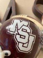
What should we call this one, how about "S Around M"?

1692198290909.png

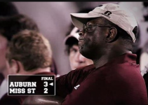
And look at this abomination, the 3-2 Auburn game and Sly Doom wearing a Russell cap and shirt

1692198421567.png
 
  • Haha
Reactions: eckie1

ronpolk

Well-known member
May 6, 2009
8,116
2,609
113
Since we’re on the subject, there’s something that keeps bothering me, and I can’t be the only one. On the boards and FB groups, I have been seeing a ton of people call this logo (interlocking MSU) the MSJ and it’s annoying.

it is my understanding, the msj is an earlier interlocking logo (80s) that when you look at it, the right side of the U is obscured by the S. The logo we all love is not this logo.

I can’t be the only one cringing
I honestly don’t think I’ve ever heard it referenced as MSJ until this thread. Until your post, I was trying to figure out what in the world MSJ was.
 

Darryl Steight

Well-known member
Sep 30, 2022
1,683
2,545
113
Yeah I dont think that’s the case here. It’s just a logo. No one trying to play 4-D chess over that.
I was joking, hence the "I know everyone is buzzing..."

I agree with you, it's just a logo, but someone needs to get the word out. You would have thought we won the national championship yesterday.
 

Jack Klompus.sixpack

Active member
Mar 6, 2021
333
286
63
Since we’re on the subject, there’s something that keeps bothering me, and I can’t be the only one. On the boards and FB groups, I have been seeing a ton of people call this logo (interlocking MSU) the MSJ and it’s annoying.

it is my understanding, the msj is an earlier interlocking logo (80s) that when you look at it, the right side of the U is obscured by the S. The logo we all love is not this logo.

I can’t be the only one cringing
IMG_6680.jpeg
 

Maroon13

Well-known member
Sep 29, 2022
1,749
1,751
113
The rest of the story is Byrne hired a national marketing firm to create our official brand. The national firm designed the logos (linked in this thread and currently on the Mississippi State University website) and our first real attempt at branding occurred. So all these stories about copying Marshall, Templeton and Croom are irrelevant. Byrne, other decision makers at State and a national firm created the current brand that did not include Nikes MSU because felt MState was the better logo. For me, when I think of MState, I think of Byrne, Dan, Dak and Schaffer.

Speaking of Byrne, when it comes to making decisions, someone has to be the leader. Otherwise you get a million opinions and request, none of which will be the same. You can see this every damn time the university trots out a new throwback to make a buck. We have people wanting only baseball logos for everything. This msu and that msu, flying M, 70s practice jerseys and pirates and jolly Rogers... what a cluster.

Also, talk about deception... bringing back logos that the school isn't going to use long term, to make adidas more money. It dilutes the brand and creates confusion. But hey.... make that coin &elmon.
 
Last edited:

OG Goat Holder

Well-known member
Sep 30, 2022
7,597
7,167
113
The rest of the story is Byrne hired a national marketing firm to create our official brand. The national firm designed the logos (linked in this thread and currently on the Mississippi State University website) and our first real attempt at branding occurred. So all these stories about copying Marshall, Templeton and Croom are irrelevant. Byrne, other decision makers at State and a national firm created the current brand that did not include Nikes MSU because felt MState was the better logo. For me, when I think of MState, I think of Byrne, Dan, Dak and Schaffer.

Speaking of Byrne, when it comes to making decisions, someone has to be the leader. Otherwise you get a million opinions and request, none of which will be the same. You can see this every damn time the university trots out a new throwback to make a buck. We have people wanting only baseball logos for everything. This msu and that msu, flying M, 70s practice jerseys and pirates and jolly Rogers... what a cluster.

Also, talk about deception... bringing back logos that the school isn't going to use long term, to make adidas more money. It dilutes the brand and creates confusion. But hey.... make that coin &elmon.
Agree with all except I don't mind the throwbacks, as long as they are just that....throwbacks.
 
  • Like
Reactions: Maroon13

OG Goat Holder

Well-known member
Sep 30, 2022
7,597
7,167
113
Nah this ain’t it. The interlocking is the past, present, and future. The response from fans on social media and selling out a ton of the interlocking merchandise in less than 24 hours should tell you something. We were in the wilderness logo and uniform wise for nearly twenty years.

Now it’s time to get back to who we are. The vast majority of fans and outsiders recognize the interlocking is who we are. Don’t run from it, just embrace it. The interlocking ***** on anything we’ve done marketing wise since Sherrill retired.
It's over, man. We are State, not MSU.

Enjoy the Kentucky game, and move on. I promise you that logo won't stay. Bookmark this post.
 
  • Like
Reactions: AFDawg and Maroon13

1putt

New member
Aug 6, 2023
8
15
3
Honestly the term "ole miss" is really great for them. Without this term the dont have nearly as much identity, it carries weight with/for them. I know exactly what you are saying, it is an extremely racial term, but they have done an incredible job of sweeping that under the rug (even when it gets national media traction) and its the reason why they have fought so hard to not get rid of it. It is their identity. They remove the term ole miss and they lose their legitimacy within 5-10 years.
That is why we should all call them Old Myth, because that is what they truly represent and what they are in reality.
 

ckDOG

Well-known member
Dec 11, 2007
8,197
2,506
113
I'm of the opinion that we need to stick with a logo. I think changing as often as we have lessens brand recognition nationwide. Most of the iconic teams have logos that they have stuck with for decades.
Agree. It should have always been the interlocking MSU. Never should have ever been changed. Time to right the wrongs of the past and stick with it.
 
  • Like
Reactions: Will Rogers.sixpack
Get unlimited access today.

Pick the right plan for you.

Already a member? Login